What's new

Graduation Announcement Shoot

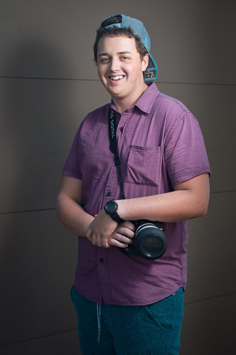
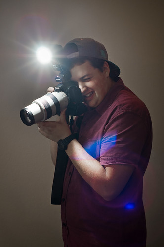
Tevo, honestly #1, the lighting is a little harsh producing a shadow on the wall. #2 isn't that bad, but I'm not sure it would be good for an annoucement photo. I personally don't care for the hat. (To me it clashes with the shirt.)
 
Tevo, honestly #1, the lighting is a little harsh producing a shadow on the wall. #2 isn't that bad, but I'm not sure it would be good for an annoucement photo. I personally don't care for the hat. (To me it clashes with the shirt.)

That's true, I didn't mind the shadow too much but it does look a bit strong now that I think about it. He asked me for a picture involving him using his camera, which is why I shot the second one. An "environmental portrait" of sorts.
 
I don't mind the shadow, especially if these are going on one of those small announcements that you mail to people.

In number two, though, he seems too awkward or something. It's too staged-looking to me instead of natural.
 
A coule of things here:

1. Does he always wear his cap that far back on his head? I think a little more level would look better, or else ditch the cap.
2. #1 is the better, but get more distance behind him in front of the backdrop, and move the light a little more to the left. You can drop the output a little bit if you want it darker.
3. Pose is fine, camera, crossed arms, and everything else EXCEPT the string hanging from his waistband. Tuck it in please.
4. (nit-pick) the horizontal line in the backdrop is somewhat distracting.
5. #2 is not ready for prime time.
 
I agree that the first is the better of the two. The second would have been better without his flash firing, and the subsequent blue flare.
 
Thank you all for the replies.

I was without my backdrop today, and I choose to use the simplicity of a garage door as the backdrop. However, I had to put him fairly close to the door which was not as desirable. In the future I will put the model farther away from the background. As for the hat, it was his choice for clothing and he opted to keep it, so I worked with it. Designer, thank you for the model preparation tips. The second photo was an attempt at showing him participating in his favorite hobby, and it was actually not very staged. I told him to stand and take a picture of my cat (on the bed in front of him) and I photographed him doing so. I do agree that it looks a bit staged, any tips on making a shot like that appear more natural?
 
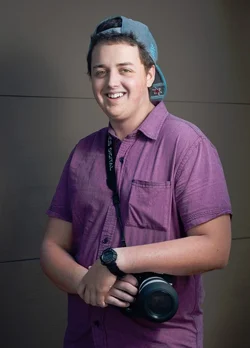
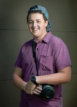
My quick and dirty edit and a crop.

$qce0jbhz.webp$qce0jbhz1.webp
 

Create an account or login to comment

You must be a member in order to leave a comment

Create account

Create an account on our community. It's easy!

Log in

Already have an account? Log in here.

New Topics

Back
Top Bottom