leeroix
No longer a newbie, moving up!
- Joined
- Aug 31, 2011
- Messages
- 1,058
- Reaction score
- 429
- Location
- California
- Can others edit my Photos
- Photos OK to edit
Looks like a pretty miserable place to be laid to rest...
Follow along with the video below to see how to install our site as a web app on your home screen.

Note: This feature currently requires accessing the site using the built-in Safari browser.
Great, another person that puts their name in every thread title.

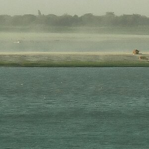
I did a crop and left it in color, is this any better, to me i like the black and white more
<img src="http://www.thephotoforum.com/forum/attachment.php?attachmentid=62875"/>
I did a crop and left it in color, is this any better, to me i like the black and white more
<img src="http://www.thephotoforum.com/forum/attachments/black-white-gallery/62875-grave-yard-deon-hamilton-dsc_2870.jpg"/>
I like the edited one better. While I think you could have composed the original shot better in camera by keeping the horizon away from the grave on the right (maybe shoot it from a lower perspective), the cropped and color version works better for me. I think moving the horizon to the upper part of the photo gave the foreground visual priority and the color gives it more depth.
What do you think about the edit besides preferring B&W ? Is there any difference between how you see the two photos ?
yep i see it makes this photo more about the grave yard than the sky but i do feel the black and white makes it feel more gloomy.
Wondering if you guys are missing the funniest part of the OP's post..... "Before you judge Negative, Please provide your own similar work for a positive example", then asks for critique.
OP, do you only want positive comments???
Here are my comments, the photo doesn't work and suffers from several fatal flaws.
1. Too many blown highlights.
2. Centered horizon. Composition 101
3. The flared out levels of the two tall structures are even with the horizon. A depth killer.
4. Cluttered foreground. There is so much going on there, barely anything is distinguishable.
5. Looks to me like you shot this standing up, from eye level. You just can't shoot a scene like that. Here, you need to vary your perspective and experiment with DOF, or else all of your photos will look like a jumbled mess.
As for the trademark, it is just odd, even more bizarre than when you see these people start watermarking thier photos a week after buying their first DSLR from the Sam's Club.
i am posting my photos here so people will give Negative feedback i like good feedback but really i am after the Negative ones. all i am asking is if your going to make a Negative comment to also provide your own similar work for a positive example of what your talking about to show me how i should be doing it ;-D for the naming and the ™ if you have a problem with it that's your own problem not mine. i don't do photos to make money its JUST a hobby so im not worried if anyone took my photos, not that anyone would want them anyway lol but at lest they will know who took them unlike many of you silly buggers who don't put your name on anything. also ive always been told to name your work ;-P
i am posting my photos here so people will give Negative feedback i like good feedback but really i am after the Negative ones. all i am asking is if your going to make a Negative comment to also provide your own similar work for a positive example of what your talking about to show me how i should be doing it ;-D for the naming and the ™ if you have a problem with it that's your own problem not mine. i don't do photos to make money its JUST a hobby so im not worried if anyone took my photos, not that anyone would want them anyway lol but at lest they will know who took them unlike many of you silly buggers who don't put your name on anything. also ive always been told to name your work ;-P
... Consider yourself lucky that better photographers are willing to give you feedback at all, arrogantly expecting them to do even more will get you nowhere. In fact, it will make people dislike you. Can you see that is already happening?

![[No title]](/data/xfmg/thumbnail/34/34072-be456691237ae73cb2936416e2e9e8c0.jpg?1619736266)

![[No title]](/data/xfmg/thumbnail/34/34069-7b423c5bb5d324f4d924cf839cc122b3.jpg?1619736265)