So... my background is "fine art", mostly urban/industrial landscapes, architectural, etc..., with some studio portraiture included. My C&C is informed from that point of view in terms how I mostly look at the exposure/composition rather than the moments/emotion. Maybe that's why I'm lousy at event photography and street photography and should probably work on it more. Event photography and I... well... we just don't get along... back in the days of film, I decided that I'd never shoot another wedding ever again in my life. So far, I've held true to that decision in spite of family/friends asking me to shoot their weddings.
That said:
1. It might be my monitor, but the white balance feels a little bit cool and the horizon isn't level. I kind of wish that there was some negative space on the left side of the frame because the arrow is pointing in that direction.
2. No beef with this one! I REALLY like it because of how tastefully simple the dress is and how basic and effective the composition is. The tilted camera technique actually works here (I can't believe I just said that!) as it gives a slightly diagonal line from the upper left to lower right which accentuates how the dress flares out at the bottom. The exposure is SO well done considering how tricky it is to shoot a white subject against a bright backlit background! Very nice work on this one!
3. Tilted camera doesn't work as well for me on this one and I'm distracted by the tree behind his head. I LOVE the veil sweeping out to the left side of the frame and the way that it echoes and blends in with the clouds above it! Exposure here, nailed as usual with great skin tones.
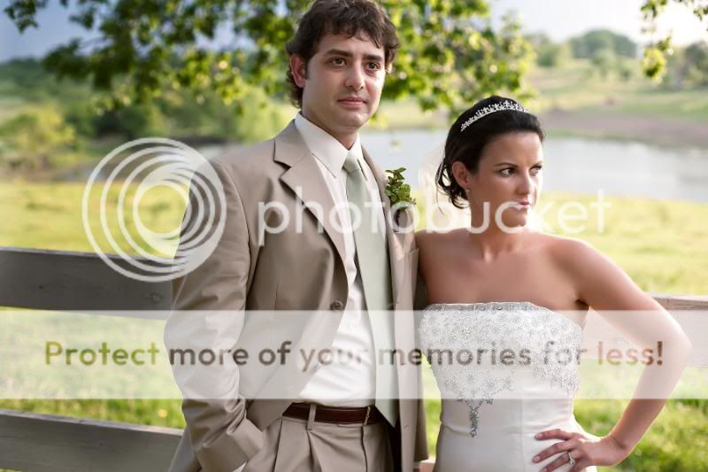
4. Hotspots on their faces are a little distracting, but being outdoors in direct sunlight makes that difficult to avoid. The thing that I notice first about this photo, though is that there is a triangle here. The groom makes a vertical line, the bottom of the frame makes a horizontal line. And the diagonal is a line from the top of his head, to her head, and then on down her left arm. Because the diagonal falls off to the right of the frame, compositionally, it would have been nice to have more negative space off to that side. Plus her eyes are cast in that direction further increasing the desire for some negative space for her to be gazing off into. Other than the previously mentioned, unavoidable hotspots, the exposure is great!
5. Another great moment! He looks so happy and relaxed! The tree and the top of the head over his right shoulder could have been blurred out with a shallower depth of field and the flash is causing fairly flat lighting on his face and creating some shine, but the catchlight is part of what makes his expression look so happy! Plus, the flash was probably needed for fill and to stop his arm.
6. This, I LOVE! I have no nit to pick with this shot whatsoever. Gorgeous sky, the way the lean of her body echoes the lean of the tree-trunk, the lines of the fence leading off into the distance... FABULOUS!
7. Nice photo collage!
8. Compositionally, head chopped off at the top of the frame, there's the workings of a triangle there that could have been emphasized if framed differently... yada-yada-yada... WHO CARES WHEN YOU HAVE A CATCHLIGHT LIKE THAT?! WOW!!
9. You know what I'm going to say about vignetting so I won't... I love this photo, though. I just wish the focus on their faces was sharper. But what a sweet, sweet capture!
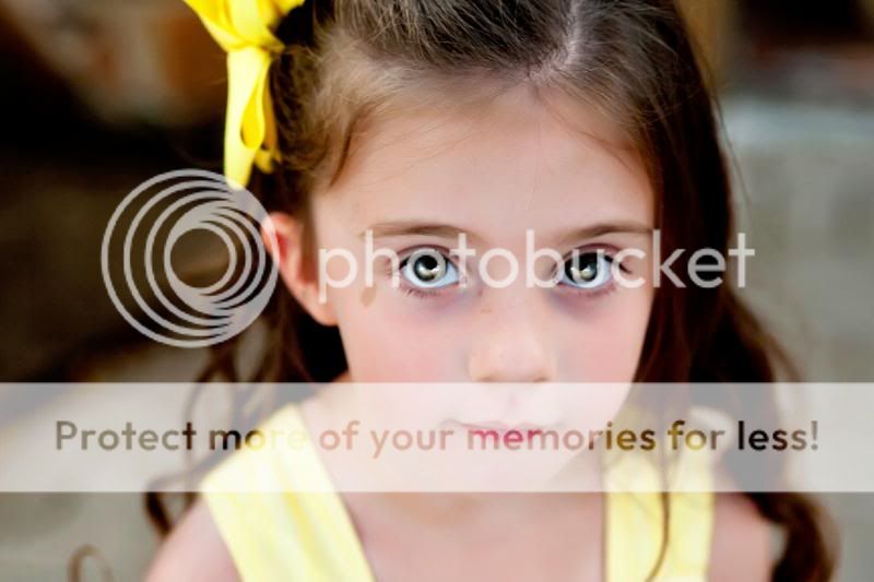
10. This... may be my favorite! The curiosity of a child, a great exposure in a tricky lighting situation, wonderful colors, and a great composition with the curve of her body and the curve of the light pattern on floor matching the curve of the light ball and those curves being contrasted against the lines on the brick patio floor. Great photograph!


") That is in a perfect world.
That is in a perfect world.


![[No title]](/data/xfmg/thumbnail/37/37659-7302b7a4f9ae50a952748e8b395695fe.jpg?1734170815)
![[No title]](/data/xfmg/thumbnail/42/42022-b164b48fbcd31e32040c4983ecb8983a.jpg?1734176406)
![[No title]](/data/xfmg/thumbnail/37/37660-eb4529b6ea38a042c4e9b64866178d7b.jpg?1734170816)


![[No title]](/data/xfmg/thumbnail/32/32715-2fc6326453c7dda13dae0bbb0cc16864.jpg?1734162341)


