What's new

Grinder C&C please

firelight

TPF Noob!
Joined
Apr 22, 2012
Messages
18
Reaction score
1
Can others edit my Photos
Photos OK to edit
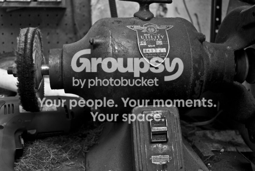
Hi everyone, I'm new to digital slr's, but I spent a good deal of time using film slr's in the past. Please let me know what you think, C&C at will

taken with:
Nikon d80
18-55mm ED lens
manual
ISO equiv 200

tools-3.jpg

30mm f4.2 2.0sec

I thought the textures were rather interesting, so I decided to try the image in black and white.
 
C&C per req:

1. This is definitely a good subject for a monochrome conversion, but I'm not sure that this is the best capture you could get. First of all, The scene is a bit cluttered, between the pegboard background, the hand drill, etc. A little tidying up before hand and a longer focal length from farther back might have helped to create a stronger image. I also think that you should have included the whole machine; as-is, I suspect that the grinding-wheel side with the guard is probably more interesting than the buffing-wheel side. Alternatively, a portrait orientation including just the maker's tag and the power switch might have been interesting.

Just my $00.02 worth - your mileage may vary.

~John
 
I'd like to see the last pic shot with some harsh dramatic off camera flash with some of that ambient light mixed in
Initially, I wanted to capture some of the clutter, I think it reflects the age and use the workspace has seen. While thinking about it though, I believe that the background could distract from the subject, I'll try that in the future.

I suspect that the grinding-wheel side with the guard is probably more interesting than the buffing-wheel side
My original intention was to capture the whole machine, though a tripod in a cramped garage only permits so much freedom.

a portrait orientation including just the maker's tag and the power switch might have been interesting
I agree, and I didn't think about that initially! The badge is a very interesting subject on it's own, I think I'll go try it out.

Thanks for the input!
 
I agree with John's comments. I also think that the texture isn't as obvious in this shot as it probably was to you in real life. The grinder itself is largely various shades of grey. It does dip pretty close to black in the shadows (more on this later), but even the lightest areas (on the manufacturer's tag) aren't too close to white. I suspect that if you clean up the area (get rid of the light objects behind the grinder) you'll be able to get more tonal range on the grinder itself, which will help with the contrast and show off the texture.

Per your exif data you used a 2 second exposure, so I'm assuming this was shot with available (overhead) light rather than off camera flash. The overhead light, where it hits, provides pretty even lighting. Try this with OCF, lower than the overhead and to the side, and you can create shadowing which will help define the topography of the grinder casing. De;ending on how low you place your light, you can determine the amount of shadowing on the lower part of the grinder. I'm mostly thinking about the buffing wheel - as it is here, most of the lower half is in strong shadow, so all the detail of its texture is lost.

I'd also explore shooting this from a variety of angles. To be honest, this not-quite-dead-on angle doesn't work for me. If you shoot it dead on and centered you will have a subject with some very nice symmetry (the manufacturer's plate, the on/off switch, etc are nicely balanced horizontally, while the buffing and grinding wheels have pseudo-symmetry). Or you can go with more of a 3/4 angle approach, with either wheel in the foreground and make the texture of that wheel, rather than the casing, the subject of the image.

Just a few suggestions, take them or leave them...
 
Rob, thank you for the input. Those are some good ideas, and I appreciate the suggestions for lighting. At the moment, separate lighting units and flashes are on my to buy list. I also agree that the angle is a bit awkward.

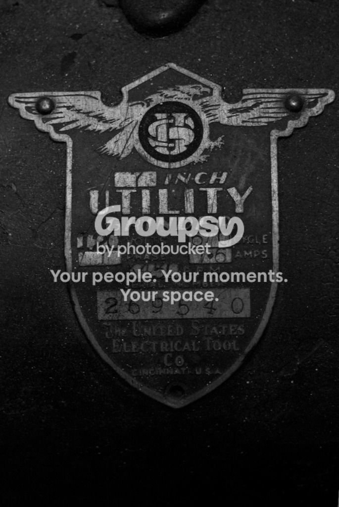
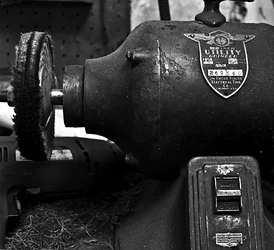
I took a few more shots focusing on the badge this time. My main question is did I push it too far in the dark direction in post-processing? However, any CC will be valued. and thank you as always

GrinderBadge.jpg

55mm f5.6 2seconds
 
I agree with previous comments about the angle and framing. It would be better to have either the straight-on vertical shot of the middle as suggested earlier or turn the camera a little to the left and just a bit down from the position you had - this would give us a better look at the clutter you wanted to show and also capture a little more of that switch plate, which has some nice texture and contrast.
 
Both of these photos are almost straight and almost centered/aligned, but not quite. By getting close to straight, or centered, or almost completely in frame, you give the impression that you're trying to get it straight, or centered, or in-frame and failed. These look like mistakes. My advice is, if you're going to cut off part of the grinder, or get the badge twisted in the frame, go for it. Make it obvious. Cut off a LOT of the grinder, place whatever it is in frame at a radical angle, so we know it's not a mistake. It might be a bad idea, but it's not a mistake.

The first image is too busy, I feel, and could use either more contrast, or be pushed down darker. If it's going to be relatively flat, make it at least dark, I figure. There's no drama in your version, it looks like a mediocre photo of a tool. Try taking a very dark photo of half of it, or a well-exposed photo of half of it, and push the contrast around. You'll see more drama -- you might not like it, but you'll see what I mean.

The second image just doesn't seem that interesting. Maybe if you backed out a little, and made it a photograph of the badge, but with a little more context around it. Maybe not enough to see that it's a grinder, but enough to see that it's something -- leave the something up to the viewer to guess. A little mystery is good, give the viewer a little something to think about.

$tools.webp
 
Last edited:
I like the intent with the closeup of the badge. As amolitor pointed out, it's just not quite level, which comes across as an error. When you have a subject with lines which are obviously meant to be horizontal (such as the tops of the wings here) or vertical (the sides of the badge), make darn sure you nail it. Otherwise it feels off (why people always harp on tilted horizons). If you didn't already, try reshooting this a bit wider. That will give you allowance to tilt it in post if needed to really nail your orientation. I personally think this would look better in a square crop anyway (add area left and right) and centered vertically (leave the same space between the top and bottom points of the badge and the top and bottom of the frame).

As for lighting, I understand about budgeting and adding pieces as you go. For something like this, however, you don't necessarily need strobes - you're not trying to freeze any motion. You can play around with light position by bringing in a table lamp, or block up a flashlight - you can even dummy up some DIY modifiers, like a home made softbox. You clearly have no qualms about using your tripod and "long" exposures to deal with lower power light sources, so feel free to play around.
 

Create an account or login to comment

You must be a member in order to leave a comment

Create account

Create an account on our community. It's easy!

Log in

Already have an account? Log in here.

New Topics

Back
Top Bottom