Fred Berg
Been spending a lot of time on here!
- Joined
- May 17, 2011
- Messages
- 1,802
- Reaction score
- 748
- Can others edit my Photos
- Photos NOT OK to edit
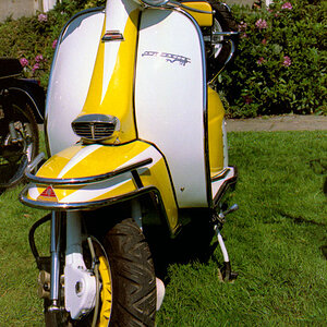
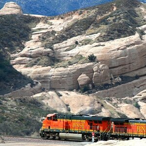
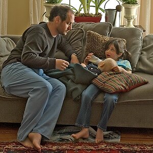
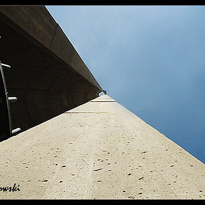
1.View attachment 19009
2.View attachment 19007
3.View attachment 19010
4.View attachment 19008
5.View attachment 19011
C&C appreciated
2.View attachment 19007
3.View attachment 19010
4.View attachment 19008
5.View attachment 19011
C&C appreciated
Last edited:
![[No title]](/data/xfmg/thumbnail/34/34694-c8f837b622c45caaa51c5507b8835376.jpg?1619736605)
![[No title]](/data/xfmg/thumbnail/32/32806-e16129723fd659a65a21d27ec96c2637.jpg?1619735667)
![[No title]](/data/xfmg/thumbnail/34/34693-68d7ff80dc154cec1604c718d5434ecd.jpg?1619736605)

![[No title]](/data/xfmg/thumbnail/32/32805-61ca9a4fb87d37c0ef4f991ac1705e1f.jpg?1619735667)