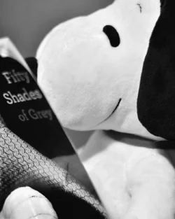
I like the first one you posted best. I think the idea was clever and the execution was well done. Good depth of field - made the words legible but nicely blurred. And I like the b&w conversion as well.
I like the first one you posted best. I think the idea was clever and the execution was well done. Good depth of field - made the words legible but nicely blurred. And I like the b&w conversion as well.
thanks. I didn't put much time into these obviously it is more a facebook like type of photo. I did choose bw because it fit the title of the book better and I thought added some kind of irony on top (though possibly a reach).



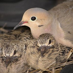
 Very cute.






![[No title]](/data/xfmg/thumbnail/35/35266-f58b019dadff6920c09071a847f052c3.jpg?1734166927)

![[No title]](/data/xfmg/thumbnail/31/31011-439c1242fe08cf6b54f32bf06523a567.jpg?1734159083)