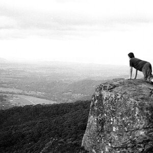
I will hit just a few of the basic guidelines (they aren't rules.. jut guidelines based on what has been found to be pleasing to the eyes in recorded history)
#1 Typically a centered Horizon is something to be avoided. You literally nailed dead center in this photo (red line is dead center):

#2 Horizona should always be flat.... especially on water! Tilted horizons do not look natural! You did an excellent job on this... Horizon is as flat as possible! An example of a tilted horizon would be:

Doesn't that look awkward?

#3 There is a Guideline called Rule of Thirds... where basically it has been found that if a Horizon is placed either one thirds up or down on a image, it is more pleasing to view. (this is more or less a Landscape type Rule of thirds... there are other ROT's for shooting other subjects!)
Sky 2/3s, Ground 1/3 example

Ground 2/3s, Sky 1/3 example

Which to use is up to the photographer, based on what they are trying to do... and what the subject is. Can you see why this might be considered to be better than the centered horizon? If you want to emphasize the sky, you can.... or the ground. Your choice!
There are many guidelines meant to help improve your images, as well as many technical terms, techniques and other things... that will all help you to improve and start developing your own individual style.
One good place for a lot of information is here:
Digital Photography Tutorials
I hope you find all of this helpful.










![[No title]](/data/xfmg/thumbnail/37/37603-739c5d9b541a083a12f2f30e45ca2b7b.jpg?1734170731)