One word:
Saturation
Light is made of many different wavelengths, they all combine in different ways to produce the variety of colour we see. Brown is mainly a combination of red, yellow and blue. When in shadow it is only really lit by the light from the blue sky. It still contains reds and yellows, but the blue is a little more dominant.
Different light sources has a different color, and our eyes/brains are very good at correcting for this.
Absolutely, which is why you don't notice the slight blue shift in the shadows as much as the camera.
When we talk of red, for instance, we don't talk of a colour that is comprised entirely of light of a single red wavelength, but rather it is a variety of wavelengths where red is the
dominant wavelength.
Saturation is a measure of how dominant the dominant colour is, it is a ratio of it to the other wavelengths of light. Now a colour is fully saturated when it is of one wavelength of light only and increasing saturation works by slowly removing or subtracting the other colours of light until only the dominant colour is left.
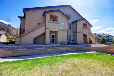
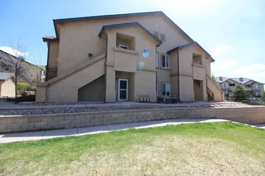
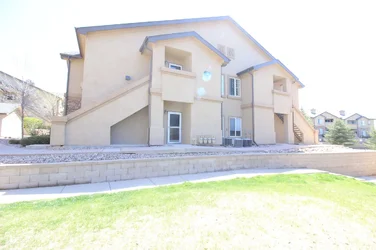
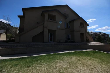
In your case the shadowed brown lit by the blue sky had a slight blue tint, blue was slightly dominant and saturation has stripped the other colours back and made it more dominant (saturated) during the processing or HDR, which is what HDR normally does.
Here is the colour picker:
Look at the HSL values and you'll see that the only shift in colour is in the saturation (you can see it clearly on the chart as well). If you look at the RGB values you can see the effect this has. The blue component that was dominant in the original colour has become more dominant (saturated). Colour shifts in shadows are quite common on HDR and saturated images.
Accurate white point adjustment is usually quite critical if you're going to do any HDR or other processing that boosts saturation and can help. But you'll find that shadows under a blue sky normally have a slight blue cast, which saturation just brings forward.
EDIT: Sorry, I get so used to calling it HSL that I forget that it's actually labeled HSB in Photoshop. HSL (Hue, Saturation, Luminosity) or HSB; (Hue, Saturation, Brightness) is basically the same thing (because it's impossible to represent how colour actually behaves in the digital environment and on your RGB monitor a few assumptions and approximations have been made). It is how colours are described in the real world where light exists in all wavelengths and is a perceptual model of colour based on how we see it. RGB only describes how those colours are rendered on your RGB monitor using only Red, Green and Blue light, it does not describe colour in the real world.
Hue is the dominant colour, the wavelength or group of wavelengths that's most dominant.
Saturation is a measure of the ratio of the dominant wavelength to the other wavelengths present in the colour. The less saturated a colour is the more it is made up of a variety of wavelengths the more saturated it is the more one wavelength or group of wavelengths is dominant. A fully saturated colour is one of a single wavelength only such as the colours of the rainbow.
Brightness is simply it's value between black and white.
On the chart fully saturated is on the right, fully un-saturated (grey) is on the left. 100% brightness is at the top and 0% brightness (black) is at the bottom. There is a separate chart for each of the 360 degrees of Hue and they're basically vertical slices of the colour wheel.
If you look at the HSB values you see the middle exposure has values of Hue: 224, Saturation: 35% and Brightness 41%. In the final combined you see values of Hue: 228, Saturation 75%, Brightness: 51%. The variety of colours that make up the brown have been stripped back to leave the more dominant hue of blue.




![[No title]](/data/xfmg/thumbnail/34/34145-b89ccc67a24004d6d7a9026a7395914b.jpg?1734164727)


![[No title]](/data/xfmg/thumbnail/40/40287-4f839095000f74d779b90ed75df9dc62.jpg?1734174702)