Raddy
TPF Noob!
- Joined
- May 3, 2007
- Messages
- 63
- Reaction score
- 8
- Location
- Detroit
- Can others edit my Photos
- Photos OK to edit
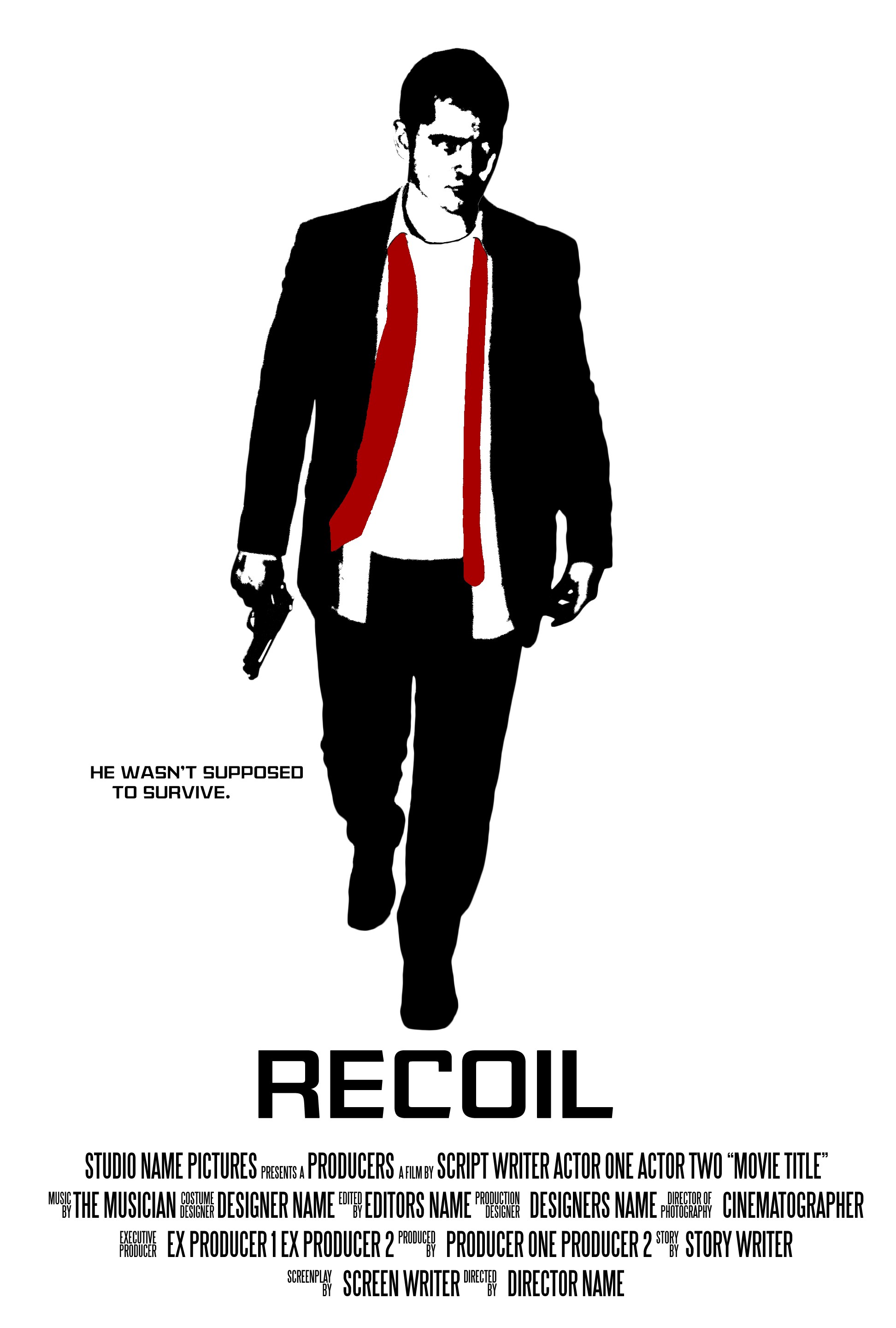
I'm making some fake movie posters to hang up around my apartment, and I'm a little torn on how I want to work this one. Here's my first pass at it:
I'm not 100% sold on the monochromatic pseudo-Reservoir Dogs look yet. I was thinking that high-contrast, desaturated version could work as well. Here's what the untouched color version of me looks like:
And I also have versions with the tie tied, walking away, sitting down, but I really think I like this pose the best.
I'm also open to suggestions for the text placement (I'll fill in the credits later), addition of a background, font selection, etc. Let me know what you guys think!
![[No title]](/data/xfmg/thumbnail/31/31707-a2840f3af9af3a4fa6f6dfbd4028eae5.jpg?1619734964)
![[No title]](/data/xfmg/thumbnail/31/31708-69f4ec98ec000d4fc9a9a1cc282e8e16.jpg?1619734965)