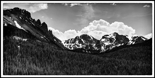
Formal composition is ok. I like the strong lines leading to the visual center. What I am not a big fan of is that the visual center is centered. Pushing it even slightly off to one side or the other would make the image a little more dynamic, to my eye. I'm not a "rule of thirds" fanatic, but it's a rare composition that really works with the critical bits centered up. If you clip just a trifle off the right hand side, for instance, the image suddenly becomes a set of echoed shapes in contrasting tones, with the pile of cloud echoing the mountain/slope on the left.
EDIT: The more I look at it, the more I am not sure. Maybe it is framed just right after all. I'm not quite feeling it, for some reason, but I'm not sure I've put my finger on why. It's still startling how different the image becomes with 10 percent chopped off the right, but I'm no longer sure that it's BETTER. It's just different.
I find the tones to be completely horrible, though. Thank you for not turning the sky black, but I do not think you did yourself any favors by turning the rocks and trees black. When you alter the image to this degree, I find that you obscure the underlying image and we tend to see instead the processing choices you have made. To be fair, this style is more and more in fashion, so perhaps eventually even I will fully absorb the new visual vocabulary, and not even notice the processing choices. I actually wrote a blog post about this sort of thing, if you're interested in one man's crazy theories:
Photos and Stuff: The Evolution of Realistic



 To be honest, I have always been relatively strong on the technical side, and much weaker on the art theory side of things. I have read many books (some make sense.. some don't) on art theory and application. I do know that my reading has modified my shooting and processing over the years in a very gradual manner... but I often end up doing what I like.


![[No title]](/data/xfmg/thumbnail/33/33490-cbbf9df0a1c31291ee7a3759afe943cc.jpg?1734163602)
![[No title]](/data/xfmg/thumbnail/39/39180-3dcdd0aa38e4d015a48a17b0e45542fb.jpg?1734173054)
![[No title]](/data/xfmg/thumbnail/34/34114-dd12be026979ccd4182c5f478bd91448.jpg?1734164566)
![[No title]](/data/xfmg/thumbnail/41/41490-6af71315284539e04ae1878cda0d613f.jpg?1734175883)