hesitant first post!

mrmacedonian

TPF Noob!
Joined
Aug 29, 2009
Messages
370
Reaction score
4
Location
Columbus, OH
Can others edit my Photos
Photos OK to edit
I joined this forum a few months ago and since then have found myself spending a good deal of time reading through the posts and have thoroughly enjoyed my time. I've stuck mostly to the beginners' forum as I am a beginner to what I've experienced as one of the more powerful forms of artistic expression.

Any way, even in my short time looking through the beginners' forum I've seen spectacular photos which make me all the more hesitant to post mine. I recently also purchased a Pro Flickr account so I figured with all the tools I would expand the C&C beyond friends and family with little or no experience.

While I know this can be a very expensive hobby I don't have a great deal of disposable income (I say this in the sense that I have no prospect of profit; simple hobbyist) and so am limited in my gear. I recently was able to upgrade my Canon Rebel XTi to a Canon 50D and rather love the difference! Here are a few shots from my recent vacation to Myrtle Beach -- in early January, so it was kinda bleh-grey -- taken with a Tamron AF 18-270mm f/3.5-6.3

Any editing or C&C is welcome, especially in regards to PP as I feel I'm especially limited there.

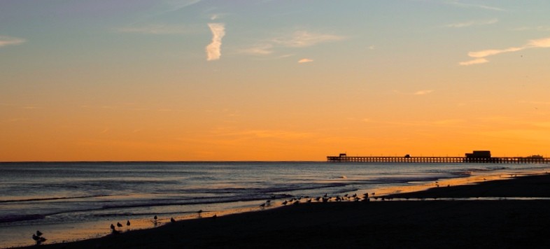
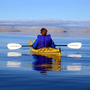
1 - One the the clearer days of my stay.

4312924340_b53b12659d_b.jpg


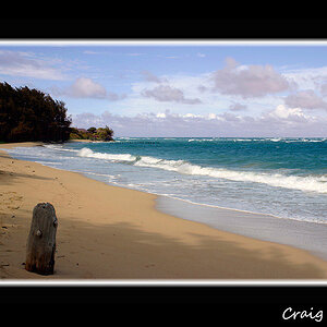
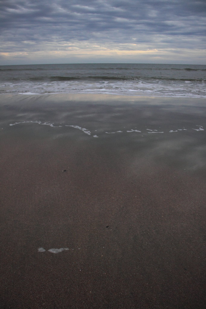
2 - A rather grey evening, felt the effect of the thin, reflective amount of water on the beach granted an interesting effect

4243661613_2160eded5d_b.jpg


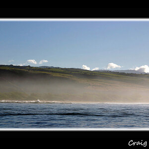
3 - Some family members walking on the beach. Has been cropped.

4244469142_b6804fae43_b.jpg


4 - Day-trip to Charlesten, S.C.; tons of shots (only about 10% made it to Flickr) of architecture/alleyways.

4243713101_ddf25cb828_b.jpg


Well, there's a few pieces I enjoy. Please feel free to make any comments.. while I'm slightly hesitant I'm also eager to learn and progress. thanks :)

oh, also quick p.s., feel free to visit my Flickr account to see others I didn't put up here in the interest of not wasting peoples' time.
 
Last edited:
The first one I love the color of the sky fading into the water but the horizon is a little crooked.

The second one it seems that the clouds had a nice formation going on so showing a little more of them would add some interest to the picture.

The third one is nice. I think the crop is a little off, there could be more space above the group and the posts on the pier are distracting. The water is a bit overexposed with some blown out spots.

The last one is again just a bit crooked and the sky is blown out. I might have taken it from a slightly lower perspective and moved forward a few paces to leave out the little bit of the house on the left side.

Overall not bad, the first one is my favorite out of the ones posted :)
 
I like #3 but the abberation from the lens around the people's silhouettes is fairly distracting. The other shots lack a subject and leave my eyes wandering helplessly.
 
I am even newer to photography than you but you are brave to post here. As an untrained eye I think your attempts are very admirable. I happen to like the bit of house in the last one. Adds life.
Keep taking pics...I like them
 
I like #3 but the abberation from the lens around the people's silhouettes is fairly distracting. The other shots lack a subject and leave my eyes wandering helplessly.

i couldnt disagree more. seems like a very close minded statement imho.

#1 is a nice picture of a pretty sky through sunset. i live by the beach, and sometimes the sky can be plenty of subject within itself.

#2 may lack a definent subject, but it surely doesn't make my eyes wander looking for what the subject is. if you sit on the beach, relax... look out into the ocean and this is what you see... endlessness and a beautiful site.

#4, no subject? really? how many shots have you seen of random dirt roads just curving into the distance w/ no distinct subject.

i personally like them. while they could use some work, i think think they are nice for a first post and have potential.

but thats me, i could be wrong. :thumbup:
 
Did you intend for that blue bin (I think it's a trash bin) in the 4th pic to be the center of attention? No matter how hard I try to not do so, my eye keeps coming back to it. It's so oversaturated compared to the rest of the pic. If your intentions were to have the attention focused on it, congratulations. If not, consider desaturating just the bin with a mask or removing it altogether with the clone tool.

The tones in #1 are brilliant. :thumbup:
 
I also like the little alley. I would have to agree clone out the blue trash bin. Keep posting I know its a little scary but great effort. Everyone starts somewhere!
 
I like #3 but the abberation from the lens around the people's silhouettes is fairly distracting. The other shots lack a subject and leave my eyes wandering helplessly.

seems like a very close minded statement imho.

My eyes couldn't find anything that held my interest in the other shots. I'm not sure how that's close minded.
 
I really like 1 and 4 but agree with the others about the subject in 2 not being so interesting.

I like the Idea of 3 but their faces etc are underexposed. I would have done the same thing but with them walking into the sun to fix this.

Also I think if you croped about half of the blue sky out of number 1 to just above the jet stream cloud on the left to make it a panoramic style and straightened it you would like the result allot more. This would put your horizon on the lower third and removed allot of unused space focusing the eye to the birds and then to the pier in the distance.

anyway just my two cents, hope this helps!

Something along these lines?

4311792109_ebda1023b0_o.jpg


Edit:

After re-reading your post I think this crop is more of what you meant..

4311838293_7952378ac7_b.jpg
 
Last edited:
The first one I love the color of the sky fading into the water but the horizon is a little crooked.

Better on the horizon? I just did a Photoshop Rotate I'm not sure if there is a more precise way.. another stop to the left leaves it crooked the other way so i'm seeing this as a happy medium (unless theres an automated or even more precise method of achieving this correction).

4312529768_cb0122939b_b.jpg
 
Something along these lines?

Yah thats the idea. I would have left a touch more sky so the horizon is on the lower third line (google rule of thirds) but it looks better composition wise imho.

Im not sure why some of the nice tones in the sky seem to have been lost on your later two edits though?
 
Hope you don't mind. I'm ok at PP. So I thought I would give it a go. I cropped it for better composition and played with the levels.

4312585546_b3f1d94876_o.jpg
 
Something along these lines?

Yah thats the idea. I would have left a touch more sky so the horizon is on the lower third line (google rule of thirds) but it looks better composition wise imho.

Im not sure why some of the nice tones in the sky seem to have been lost on your later two edits though?

I believe thats because I opened the RAW up and just made a TIF to address the crop.. the initial one I believe I increased the saturation a tick or two and with the re-crop hit "auto" and left the saturation @0
 

Most reactions

Back
Top