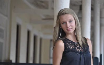
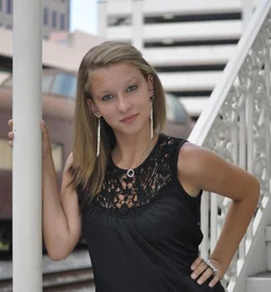
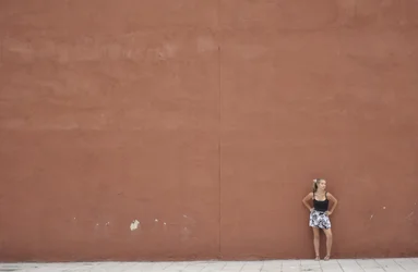
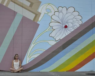
The first two are pretty nice, but she is too small in the last two.
The first one would be better as a vertical.
In the second one there is a bit of wrinkling in her forehead (the expression seems a bit forced). Also in the second one the background dominates a bit too much because it is brighter than she is.
the first one is the best, but a little post production can go a long way.
add some red and yellow to it, drop the shadows, bring up the highlights, use the patch tool on the forehead, and Be more careful with your shooting technique, there's nothing that's really tack sharp in the picture, her eyes are out of focus, and there's a little motion blur, at least for this one.
I wanted to see what it would have looked like with a vertical composition, but had to rotate the original photo 7 degrees clockwise to get the right "base" on her torso, so I had to use the clone stamp to reconstruct the pillar in the background and the top of the wall and the upper right hand corner...I'm not super fond of the tilt on the pillars in the back, but...I do like the emphasis on her that eliminating the left hand side of the shot produces.







![[No title]](/data/xfmg/thumbnail/32/32708-c55da623febe9d91efe5f28aa54c3090.jpg?1734162300)





![[No title]](/data/xfmg/thumbnail/32/32719-7d42e7d7077540fabb3fa0275a99899a.jpg?1734162364)