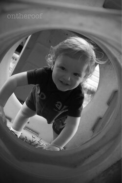
I know it's only three photos but I would be careful about heavy compositional tilting, as sometimes it becomes hard to not chop off limbs if the subjects position does not naturally fill that kind of compotition.
Like in the first photo for example. His hand is cut off, but if you would have gotten his whole hand in the frame his head would have been smushed against the edge of the frame. I think it would have looked better with a level composition. Also; the brightest [art of the scene is behind him. His face and eyes are in chadow so it's not as cute/flattering...
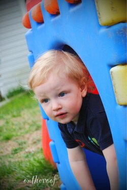
In the second one the tilt doesn't really work either because the posing of the boy and the orientation of the playhouse is very vertical, so when you tilted the photo it makes it look like he's about to fall down a hill. There is also some heavy vignetting, which doesn't really work because his hands are cut off and out of the scene. When shooting people I try not to have the vignette encroach upon them, because it changes skin tones and just makes it look a bit unbalanced.
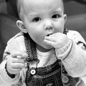
The third one is the best in my opinion. The tilt works because his posing lends itself well to it, and nothing is cut off. He's looking at the camera like in number one, but his body/face is the brightest thing in the frame, and the viewer focuses on him instead of the cluttered background like in number one. I would be careful when doing that kind of smooth almost-overesposed PP that is popular in children photography nowadays. Sometimes it just makes the highlights blown out, but I think you did it well in this photo.

")