I spent hours trying to remove some hard water marks I had not noticed wile taking the shot, I was a little dissapointed to see it go completely uncommented on.
That is the look I was shooting for on the button. :thumbup: thanks.
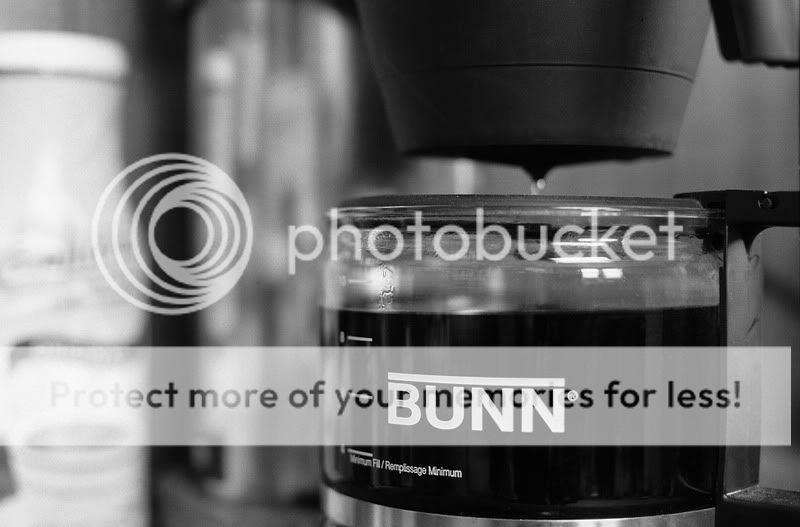
In my original composition I was a little more to the left of the pot looking at the name brand squarely but did not like right side as was and repositioned resulting in a flaw IMHO. The BUNN logo is not square as I faild to reposition the pot it self when I moved the tripod taking one of the "N"'s, the registered trademark ensignia and the "minimum" of the Minimum Fill line out of the DOF, Doah.
actually im glad the fill lines are out. i think they would have taken away from the name, you can go into PS and take the clone tool on like 90%hardness, and clean up the edge of the "N" by cloning the black coffee. that way you still keep the fill lines out, but the "N" sharpened.




![[No title]](/data/xfmg/thumbnail/36/36302-6ee4929dfdf80290ffd73704693e860f.jpg?1734168631)