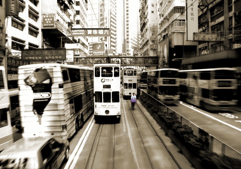
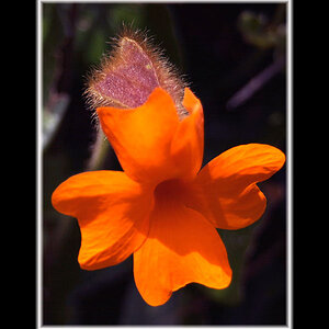
I actually don't have a lot of critique here. It's a well captured, well processed moment. Centered compositions are generally not as interesting as those that use the rule of thirds, but when used as an effect (like here), it can make it stand out better. There are also a lot of blown highlights, but again, that's the effect you are going for here, and it works. The focus also seems slightly off, but once more, it doesn't matter, as it conveys the sense of motion.
I do have a couple points of critique, though. There's a small part of a tram cut off on the far left. It might work better as a composition if that were cropped out. Secondly, why is the guy in the middle bluish while the rest of the photo is monochrome sepia? It's unsettling and I think it detracts from the photo.
Yeah, my idea was to make the guy in the middle stand out, but maybe the image mostly suffers from it. I also agree that the vehicle to the far left (a bus) looks cut off, never quite noticed that before.
I actually don't have a lot of critique here. It's a well captured, well processed moment. Centered compositions are generally not as interesting as those that use the rule of thirds, but when used as an effect (like here), it can make it stand out better. There are also a lot of blown highlights, but again, that's the effect you are going for here, and it works. The focus also seems slightly off, but once more, it doesn't matter, as it conveys the sense of motion.
I do have a couple points of critique, though. There's a small part of a tram cut off on the far left. It might work better as a composition if that were cropped out. Secondly, why is the guy in the middle bluish while the rest of the photo is monochrome sepia? It's unsettling and I think it detracts from the photo.
Although, usually i dislike selective color, i think this works. It's only a very subtle tweak but rotate the picture 0.2 degree right. Then the edge of that skyscraper, dead-center is bang-on.

")


![[No title]](/data/xfmg/thumbnail/41/41933-d5af292b78e4b91211e86e0f3205eda8.jpg?1619739946)
![[No title]](/data/xfmg/thumbnail/41/41937-bd46d08f9adcefe8bc65477f19a4f580.jpg?1619739947)