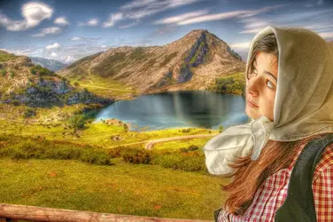
The girl and the landscape are 2 diferent layers. I like the style I reached, but I want it looking professional, need some improvements.
I like the image, but if you want to do something different with it, I have an idea of something you might try.
The background landscape you can alter the perspective just a tad so the mountain looks further away since the road in front of the lake already looks like it's further away, or you could make the girl a bit shorter/smaller so her eyes would be lower in comparison to the background mountain and it would appear that she is looking up at the mountain vs looking up at something that isn't in the actual image itself.
Just some ideas.
")


![[No title]](/data/xfmg/thumbnail/37/37643-1ec2500989f6f4894b6e6323c2d3669e.jpg?1734170766)


![[No title]](/data/xfmg/thumbnail/42/42328-c1143adda9734f7d05ce4361e79c27a7.jpg?1734176824)


