What's new

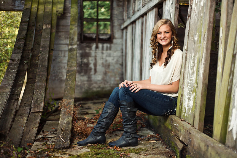
HS Senior Portrait - Strobist

Nice shots, thanks for putting up the diagram.

Question: do you think that your pop-up used for fill flash would have softened the shadows that cgipson was talking about, or would the negatives of on-camera flash overwhelm that effect?
 
Nice shots, thanks for putting up the diagram.

Question: do you think that your pop-up used for fill flash would have softened the shadows that cgipson was talking about, or would the negatives of on-camera flash overwhelm that effect?

This I'm not sure, it probably could have. But I don't have that option, since I shoot with a 5d. A second strobist kit is coming soon though :)
 
The first one is pure gorgeousness. The second one isn't bad by all means, but the first one rocks circles araound it!
 
I would like to know where the sun was in the first shot. I would be very happy with the same results. I have a nice barn that looks just like that to use for portraits.
 
I believe the sun was to the left of the barn, left of this shot
 
in the second one (miranda) the vanishing point draws me away from the subject. Leading lines are great, if they reinforce what youre trying to get across. Leading lines in a portrait that lead away from the subject are powerful distractions.
 
You have skills, son. Very very nice. :mrgreen:
 
in the second one (miranda) the vanishing point draws me away from the subject. Leading lines are great, if they reinforce what youre trying to get across. Leading lines in a portrait that lead away from the subject are powerful distractions.

Agreed, I should have positioned her to the right more, so that she's located where the eyes are drawn to.

You have skills, son. Very very nice. :mrgreen:

Thanks! :)
 
I agree with the vanishing point being detrimental to Miranda. In the first one of ashley, I LOVE the way the watermark is cleverly hidden. And, second, I think that shot would look much better cropped to a square, with just ONE of those old boards on the left allowed to remain. I did a quick piece-of-typing paper crop of it on-screen, and I think it looks awesome as a square! If cropped as a square, I would apply a somewhat heavy vignette to darken the window that would be left in the upper,left corner. It is a neat scene of dilapidation...I know how badly the salt air and the damp climate from the Strait ruins buildings up there!

Come to think of it...a square CROP of the Miranda shot, thus eliminating that light-colored vanishing point blob, and using the fence looks as a line, looks pretty darned good too!!
 
The lighting throughout these is just a hair too much for my taste, I feel like the photos are coming out a little too obviously flashed. To my taste, I would turn the strobe down maybe as much as a stop, to let the natural light breathe a bit more.

Other than that, which is just a quibble and a matter to personal taste besides, well done!
 
Thank you both for the input! :)
 

Create an account or login to comment

You must be a member in order to leave a comment

Create account

Create an account on our community. It's easy!

Log in

Already have an account? Log in here.

New Topics

Back
Top Bottom