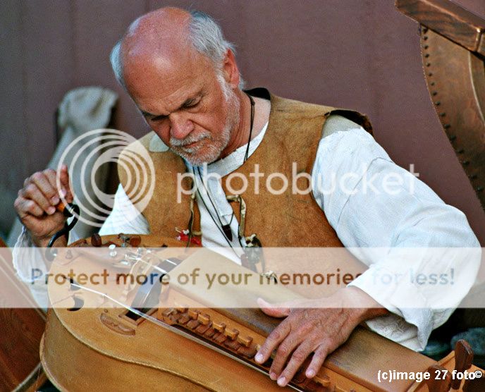
Although I agree with you John that more of the instrument wouldn't harm this photo, it was the wonderful expression of concentration on the subject's face that drew me in - and I hope I captured that at least. Thanks for the feedback, much appreciated.
Thank you, and thanks for taking a look. I really would like to have got more of the instrument in and did give myself a little kick when I got this one back from the lab - I had enough time so no excuses. But as I said to John, I was so intent on capturing his look of concentration - perhaps too intent in hindsight.
I was going through my photos this morning and came across this shot taken from the other side. Same as in the other frame I seem to have lopped a lot of the instrument off, but I thought it interesting enough to post despite this.
Hi Lew, I was wondering if you wouldn't mind going through and explaining the technical aspects that make this image impressive--just hoping to glean some expertise. Thanks.
Just my opinion but what I loved, besides the glorious color, was the intense look of concentration that was captured in a perfect triangle - his face, and left hand on the strings and then his right turning the crank. His face, the instrument and left hand are in perfect focus and one could almost see the interaction. Beautiful detail, beautiful color, beautiful composition. Even that hint of the tuning pegs to give an idea of how the instrument works is great.
There are some small weaknesses that, if this picture were mine to keep and hold onto, I might change because I think they weakened the composition and distract a bit:
That truncated instrument that is large enough to draw the eye that is off to one side.
His right hand is slightly oof and the hand/sleeve are bright enough to draw the eye.
The background is a bit bright.
Because I am a fan of tight crops, I would:
move in that attention-drawing instrument on his left and recrop so that less is seen and it closes off the corner. (also darken the brightness in that corner) Now it reinforces the curve of his jacket rather than pulling the eye to the side.
sharpen his right hand a bit (faking focus) and then darken the hand and sleeve so it recedes a bit out of attention.
Thanks for that thoughtful description. It makes me enjoy this image even more. I too think it is a beautiful work of art, but I could not have explained why. You comments have helped me grow.


![[No title]](/data/xfmg/thumbnail/42/42275-2ca41f93a172e2e510afb46912a2bb61.jpg?1734176682)


![[No title]](/data/xfmg/thumbnail/42/42273-78c0ae886bd5e6d47580353f398c92b9.jpg?1734176676)
![[No title]](/data/xfmg/thumbnail/32/32148-95f8731a01012cd472d3896791e3b7de.jpg?1734161045)


