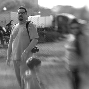
Was this a scan from a print?
The image is simply not sharp enough to be considered a "proper" one. Not that there's anything wrong with a non-sharp image, as long as you meant it to be.
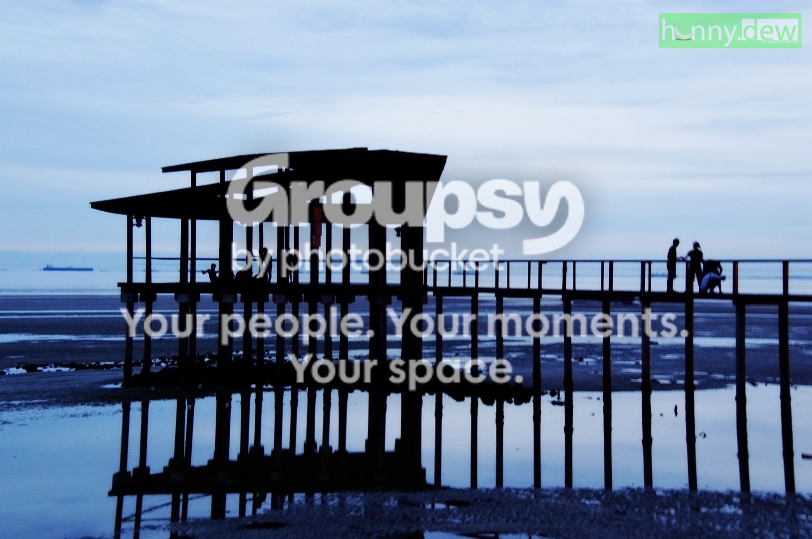
I think the reflection also carries a lot of weight and feels rather "cramp" the way it's being pushed to the bottom edge. Right now I don't see the pier as the subject. I see the pier + reflection as the subject, therefore I'd have moved the frame down a little bit to have more breathing room.
Otherwise I think the blue can be enhanced a bit more to compliment the high contrast black. I myself like to push saturation and contrast more. I like punchy stuff.







![[No title]](/data/xfmg/thumbnail/34/34593-f9e16dc135ec1fcde87624f30e703802.jpg?1734165595)
![[No title]](/data/xfmg/thumbnail/31/31096-b9b8d52b45753cd4f9251832149ef9da.jpg?1734159254)