What's new

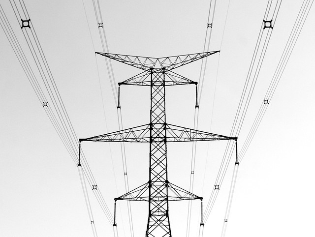
Hydro Tower in B&W

PixelRabbit

A naughty little bunny...
Joined
Nov 28, 2011
Messages
6,593
Reaction score
3,719
Location
Ontario
Can others edit my Photos
Photos NOT OK to edit
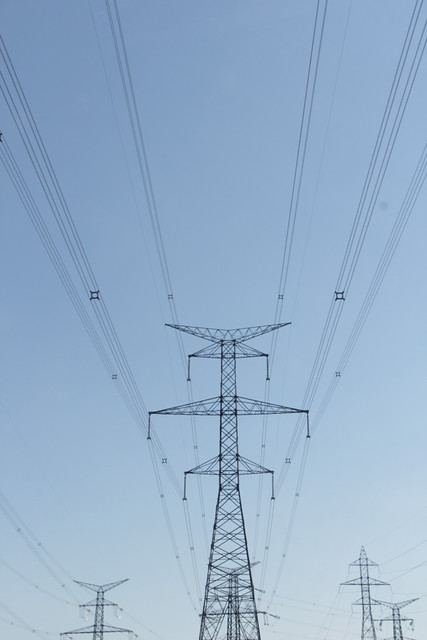
Ok I'm not afraid to admit it, I love power lines and hydro towers and I'm always looking for new ways to shoot them. This is my most recent and one of my favorites so far. I like the subtle differences and the subtle gradient in it.
Would love to hear your thoughts!
 
you just needed to change angle slightly to make it symetrical
 
You can always tell the canucks with their "hydro"!

I do like this minimalist abstract stuff, and this is a nice example of why I like it, and why I quite dislike it (even when I do it). It's graphically strong, a very visually muscular image (whatever that means) interesting to look at, rewarding to the patient viewer. Ultimately, though, it winds up being more or less a technical exercise in line and form, which doesn't say much.

This is a very fine example of the form, though, make no mistake. It is the form, not the image, that I both love and dislike ;)
 
you just needed to change angle slightly to make it symetrical
^^ Right. Sometimes difficult to see, but pay attention to the corners as you line up. The lower right is a little blown out. Aside from those nitpicks, it's a very nice graphic image - your lines are very strong. :thumbup: A perfect square would set it off well. :)
 
I like the slight asymmetry, I think if it were perfectly symmetrical the image would be more about symmetry than line and form.
 
Thanks for taking a look and the time to comment :)

amolitor said:
You can always tell the canucks with their "hydro"!

I do like this minimalist abstract stuff, and this is a nice example of why I like it, and why I quite dislike it (even when I do it). It's graphically strong, a very visually muscular image (whatever that means) interesting to look at, rewarding to the patient viewer. Ultimately, though, it winds up being more or less a technical exercise in line and form, which doesn't say much.

This is a very fine example of the form, though, make no mistake. It is the form, not the image, that I both love and dislike ;)
You actually bring up an interesting point and I agree. I'm torn when I do this kind of shot, I mean there has to be a bazillion shots out there of hydro lines (insert any cliche/overdone subject in place of the lines, waterdrops, moon, brick wall etc...) and I can with confidence say that the very shot I posted already exists.

Technical exercise is a great way to describe it and I'm cool with it being considered that.

I've thought about starting a thread about this very thing, there is probably some threads on it already but not recently (that I recall) so perhaps I'll go ahead :)

unpopular said:
I like the slight asymmetry, I think if it were perfectly symmetrical the image would be more about symmetry than line and form.
I agree, I think it is the slight differences that keep my eye traveling around the image, comparing point to point, I like that about the shot.
 
Good line and form. Good general interest. Good technically, except for the crop line at the bottom. I think it needs something to "ground" the image. I don't know what that would be just now, but the image seems to be "floating", which in my opinion makes it inherently "unfinished". Architecturally, one would expect some heavier line of some sort at the bottom to anchor the structure.
 
Thanks Designer, I went through many possible crops on this one and I think that this was the strongest but I do see what you mean, I`m not sure there really is a crop that will ground it without taking away the balance between tower and lines.

Here is an export of it sooc, thoughts?

 
Thanks DBJ.
I get what everyone is saying about the perfect symmetry, obviously being symmetrical was part of the intent shooting straight on but for me personally the subtle differences is a big part of why I like this one. They didn't jump out at me, I found the first one and my eyes and brain accepted the challenge to start comparing points and find other differences, almost like instinctual treasure hunting for differences.
 
Thanks Designer, I went through many possible crops on this one and I think that this was the strongest but I do see what you mean, I`m not sure there really is a crop that will ground it without taking away the balance between tower and lines.

Here is an export of it sooc, thoughts?

I think that is a much better composition because there is "weight" at the bottom with those other towers in the distance. It has better balance than the cropped version.

(edit) See? You're a better photographer than you realized. The "instinctual" shot was better to begin with.
 
Wanna hear something funny Designer?
Part of the reason I cropped the bottom/other towers in the distance off is the tower caught in the base of the big one was too asymmetrical and sticking out on the right hand side ;)
 
I don't mind the cropped version, but it initially bothered me not seeing the lower portion of the tower. It felt unbalanced.
That being said, I don't think the un-cropped version is an improvement either.

The ideal, in my opinion, would be to see more of the tower base, and less empty-ish space at the top.

Given the 2 choices, I would have to choose the initial post as the most appealing - with reservations.
 
Thanks for taking a look and the time to reply Sleist.
As I mentioned this is a subject I keep returning to so I'm sure there will be more shots in the future, I will take everyone's thoughts with me next time around :)
 
Wanna hear something funny Designer?
Part of the reason I cropped the bottom/other towers in the distance off is the tower caught in the base of the big one was too asymmetrical and sticking out on the right hand side ;)

Ah, yes, the symetry "conundrum". When we see symetry, we find that it is often disrupted (sometimes on purpose) by an asymetrical element. Designers sometimes introduce an odd element to EMPHASIZE the symetry that remains. Hard to explain, but it works.
 

Create an account or login to comment

You must be a member in order to leave a comment

Create account

Create an account on our community. It's easy!

Log in

Already have an account? Log in here.

New Topics

Back
Top Bottom