What's new

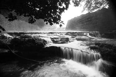
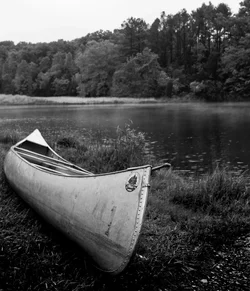
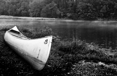
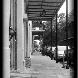
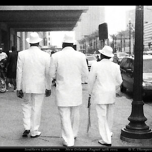
I LOVE EXTREME BW CONTRAST....but I've been told its too much...

Skhigh

TPF Noob!
Joined
Apr 5, 2012
Messages
119
Reaction score
16
Location
Nashville
Can others edit my Photos
Photos OK to edit
Should I tone it down?
 

Attachments

  • $8.webp
    $8.webp
    1.2 MB · Views: 206
  • $14.webp
    $14.webp
    722 KB · Views: 200
  • $15.webp
    $15.webp
    1.5 MB · Views: 176
Why tone it down, if it's how you envisage the images and the style you enjoy then there's no issues. I personally think they look great.
 
If you want more subtlety, and more information in the shadows, then you'd want to work on local contrast adjustments, as opposed to overall contrast. WHat you are showing are images with a high degree of overall contrast, without much differentiation between tonal values that are close to one another. THis is often called "high-contrast", or"salt-and-pepper", or some other type of somewhat pejorative term.

In the landscape shot of the waterfall--the rocks closest to the camera have blacks that are what are commonly called "crushed". I'm not so sure that that is the optimal way to render that scene....but it is one way to do it. There's often some type of a happy medium, a balance between subtlety and brashness...and other times, it's betetr to go all one way, or the other way.


A wide tonal range, paired with delicate,subtle gradations of tone would make the canoe shots VERY different from the compressed, crushed way they are rendered currently.Only you, and your audience, can determine which is artistically "more pleasing".
 
JUst to add to my post above: B&W is an abstraction of reality, and is NOT the way we see things. We see in colors. B&W removes colors, and so the clues and cues the eye and brain get from B&W images are different that they are for full-color images. Artistic intent would dictate how a scene should be rendered; different image manipulation methods, like burning-in of highlights, dodging or bleaching of shadow areas, and intensifications or moderation of mid-tone tonal values, and the degree of contrast in the highlight, shadows,and mid-tones--ALL OF THAT stuff, determines how an image looks, and influences how it is seen or interpreted by the viewer.

There is no one, best way to render an image in B&W...a light,ethereal,early-morning marine scene with a rowboat and a foggy lake setting might have almost ZERO pure black tones. The same scene, shown at 4:30 PM on a sunny October afternoon might be best rendered with a very deep,charcoal-gray sky to represent the bright, deep blue sky of a sunny fall day, and might have brilliant,specular highlights on the water, and crisp, high-contrast mid-tones, and deep, dark, yet still-detailed lower tonal values.

Also, high-contrast images can convey abstraction, or show design elements like lines or repeating shapes. Low-contrast images can convey serenity, tranquility,or darkness or dim lighting. There really is no one pat answer as to how much contrast,either local, or overall, is best, because it's highly subjective,and varies from photo to photo. It is possible to take the same negative, or RAW file, or scan, and create two wildly different images, simply by altering the contrast significantly.

 
I think you need to worry about contrast once detail is being lost, or the overall feeling is not accurate. High contrast tends to give an impression of boldness, intensity, even violence. The waterfall however works better, I still think is too contrasty dute to lost hilights.
 
You're the photographer, screw everyone else. Very few people liked Van Gough's work before he died because it didn't fit the style at the time. Stick by your guns, it's your artistic vision.

BTW, Personally I love it. I'm a huge fan of high contrast B&W and those are nice shots
 
I'm all about contrast and saturation... that being said, I love them! I think the higher contrast really makes it pop... like other people said, if it was how you envisioned them looking, I wouldn't worry about what other people think of it... but you still got tons of support!
 
Thanks everyone! I have been doing the extreme contrast for a few years now and even after getting "suggestions" from family members, I still do it. I just like to hear opinions of those who take photos as well. Hearing that I OD on contrast from family doesnt really count...lol
 
My favorite is the waterfalls. Wonderful composition. That being said, My eyes are searching for a sharp focal point and I can't find one.
I want to see the edge of the falls in the lower right quadrant in sharp focus and the softness makes me search the scene for a focal point.
The contrast levels are less an issue for me.
 
How does your workflow go when editing for this?

I am for the most part against big overall adjustments to photos, and prefer to adjust individual parts of the photo independently.

Everything has it's place, but on landscape shots like these, when you lose detail in the shadows, you've gone a bit too far.
 
Derrel has some great tips as usual, though personally I like what you've done with your images.
 
I don't particularly care for black and white, but you actually did a pretty good job on these. The blown highlights are primarily in the sky and what the blocked up areas are very minor. True it is very high contrast and the dark areas don't APPEAR to show much detail but it actually is still there, just hard to see. I played with the waterfall shot by dramatically reducing the contrast and the dark area to the lower left does still contain a great deal of detail.

Pretty well done in my opinion.
 
I do too. Do what you like. But if you can't tell the sky from a white border, tone it down maybe. It is up to you if your not working for $$.
 
Are they going to teach you about Silver medium (film/paper) ?

You should try Rollei Pan 25 B&W film printed on some nice grade 4/5 fiber based paper.
 
I don't think so, strictly digital..we may print on different paper but no film.
 

Create an account or login to comment

You must be a member in order to leave a comment

Create account

Create an account on our community. It's easy!

Log in

Already have an account? Log in here.

New Topics

Back
Top Bottom