I need some advise : |Photo critique

rangerman

TPF Noob!
Joined
Jun 20, 2010
Messages
170
Reaction score
0
Location
SEA
All comments are welcome

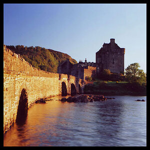
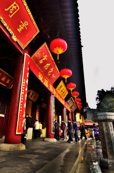
Things I did for this shot
1) I went lower using 14mm on D70s
2) I used the lanterns in red as leading lines
3) I tried to incorporate some reflection (water)
4)I tried to balance the shot with the little stone pillar on the right.
Note: Things I cannot control:
1) washed out skies.


4751253367_38cc273b3f_b.jpg
 
The slant doesn't seem to work for this shot...
You cut off one of the lanterns on the top left...leave it in or leave it out (up to you)
Pillar bottom is cut off
Desk on left is cut off
Post-process the sky if you want...
If you had exposed for the sky, the rest may have been too dark and so a few lights on the subjects would have worked...however this doesn't look like it would have been a place you would be allowed to do that (unless you own it)
I do see where you were going with this photo and see a ton of possibilities...
If this is a location you can go back to, do me a favor and attempt to get a nice photo of the pillar on the right (maybe a severely low shot/high angle)
Looking forward to seeing your progress
Oh and get a shot of one of those lanterns too...
I love the Chinese...such a beautiful, rich culture...want to learn some Mandarin and even Cantonese, such a beautiful language...I love listening to the employees of the Chinese buffet here where I live talk amongst themselves...really want to surprise them by talking to them in their language...
 
I think drex nailed some great comments. I don't like the wide distortion of the 14mm, and all those bits you cut off (lantern, pillar,...). Seeing as you mentioned it, I don't get the water reflection. And you photo should speak for itself without you having to detail what you were going for.

And you can do something about that sky...look into a very trendy (and often way over done) technique called HDR
 
I second that the slant takes away from the scene. in terms of energy, red is a warm color and it has leading lines and you threw off the scene's natural energy and movement with a weird angle. instead all I see is a slant.

step forward so the base of the pillar is at the bottom of the photo too
 
Or take a few steps back, put the pillar at the top right and use the lantern leading lines to draw attention to it...
 
Last edited:
Thanks for the tips. I cropped the photo based on some advise, sorry I can only do so much to improve it.

here it is: Straighten image, cropped off half lantern and table. cropped tighter. The rest are history. :lol:
4752302712_5cae90469b_b.jpg
 
edit = much better! :thumbup:

see how a simple edit can totally change a image.
 
I am working with pse and would like a shot on seeing how i can help using it. Would it be ok to edit your photo?
 
definitely better. now it looks like a wide angle shot on purpose. the key part is that there are people which are close enough to perfectly up and down so the photo seems balanced. you needed something that wasn't skewed.

also, the extra crop makes it look like what you cut off you meant to cut off and helps a ton. it's like the rule where you don't cut a person directly at a joint, cutting off just a touch of an object looks sloppy.

for a similar situation on balance, here's a home I took at 11mm. my up and down was carefully placed close to where the windows and garage meet. I find it helps the closer garage balance out more evenly in focus with the rest of the home. if I moved the up and down elsewhere the home felt wrong.
4737477474_91b22fff23.jpg
 

Most reactions

Back
Top