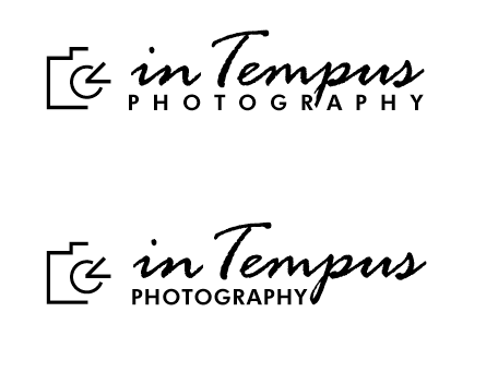
I need your help - which logo?

Which logo do you like best?

  • 1

    Votes: 26 55.3%
  • 2

    Votes: 9 19.1%
  • 3

    Votes: 7 14.9%
  • 4

    Votes: 5 10.6%

  • Total voters
    47

inTempus

TPF Noob!
Joined
Dec 15, 2008
Messages
3,692
Reaction score
4
Location
Indiana
Can others edit my Photos
Photos OK to edit
Hey all,

I really need your help deciding on a logo for my website. You guys have been a lot of help on my journey into photography, so I wanted to ask you all for your opinion on this important step (for me anyway). :)

Added note: inTempus is a play on Infinitus Intempus", or forever in time. That should explain the use of the symbol for infinity in the images below.

If the 4 choices below, which logo do you like best?

in_tempus_logo_numbered.jpg


Thanks in advance!
 
Last edited:
Nice work! Numbers 1&2 seem the same to me, as well as 3&4. They're just in a different size. I like #1 the best.
 
Thanks SlimPaul.

Yes, they are the final two designs... I'm just trying to decide if I like the larger camera icon or the smaller one with each design.

Again, thanks for the help everyone!
 
I'd go with #4

Id like to see more of an angle for the pentaprism to make it more reflective of an SLR. I'd like to see "Photography" smaller so it fits all on one line under "in Tempus". Photography is so bold that it dwarfs the actual name of the company ... "in Tempus" did not jump off the screen ... in direct competition with photography ... and it loses. I'd also make the "i" uppcase just to see how it looks.

Remember it is more inportant to communicate than to look cool. If you can do both equally well ... then great! If not then function wins over design.

Gary

If this will be use on a web site ... have the hands of the clock rotate/move.
 
Thanks Gary.
 
I like #1. I might make "In Tempus" go across the top of both the camera and the "Photography" for it to stand out. Also, in all 4 cases, I would make one of the hands of the clock shorter like a real clock. Unless that's not supposed to be a clock. then dont mind my suggestion.
 
1.Where your p in tempus touches the word photo... will look sloppy in print.
2.Agree with sun that photography should be all one word.
3. I would like to see a smaller icon. I think the large camera overpowers the message.
4. Visually I think it needs more balance.... like below

3267219950_34c4ccbdc5_m.jpg


ps..... love the name. I think you have a hit.
 
I'd like to see "Photography" smaller so it fits all on one line under "in Tempus". Photography is so bold that it dwarfs the actual name of the company ... "in Tempus" did not jump off the screen ... in direct competition with photography ... and it loses
I agree with this. When I look at it, the thing that jumps out most is 'GRAPHY'.
 
I'd vote 3, it's very basic, but in a good way. I suspect that, when paired with some photos, the angular, polygonal nature of the logo won't get in the way of what the site will be all about.
 
I agree with this. When I look at it, the thing that jumps out most is 'GRAPHY'.

Agree also. I do like # 1 if i had to choose out of the four.
 
#1. The others just don't have the same impact.
 
When it comes to logos, less is always better. With the word "photography" in there, you don't need the pictogram to fully depict the camera –it's a redundancy. That's why I don't think 1 & 2 work; there's too much information to communicate one simple idea. I'd rather have the purer lines of the camera pictogram of 3 & 4.

Agreed on the comments above about typography overlapping and the need to have the word "photography" all together. Or, as an alternative, just use "photo". Simpler is better.

Finally, your brand is "In Tempus". Your goal is to communicate your brand; therefore, it would be a good idea that the font size of "In Tempus" be bigger than "photography".
 
Ok, based on everyone's input I've come up with some revised ideas. I will pick from one of these 4... I'm thinking I like the 2nd one down from the top.

logo1.png


logo2.png


What do you guys think?
 

Most reactions

Back
Top