Yemme
No longer a newbie, moving up!
- Joined
- Apr 30, 2008
- Messages
- 2,654
- Reaction score
- 13
- Location
- NY
- Can others edit my Photos
- Photos NOT OK to edit
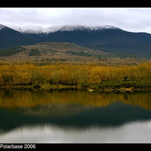
good
-interesting comp (lines and shapes)
-good light
nit
-black film border is a bit of a distraction
-photo is flat (lacks contrast)
-photo lacks color vibrance
-photo has alot of dirt specs
-photo is noisy
tweak
-cropped the black border out
-set black and white points (room still left on the histogram)
-added a tad of global contrast boost
-added a tad of selective color saturation to just the trees with color
-lightened (dodge) the lower window frame were the light is reflecting
-lightened (dodge) to main vertical window frames
-healed out the dirt specs
-put the photo through NR software
Hope this helps and thanks for posting.
Take care,
Dwayne Oakes
Thank you Mr. Oakes... Great job. I hope I can really count on you for 19 more.

I'm gonna but your version on my blog.:hug::


![[No title]](/data/xfmg/thumbnail/31/31705-3469470a562bc1a3bad361889544af19.jpg?1619734963)