Ice Cream Stalkers

Tuna

Fotoğrafçı
Supporting Member
Joined
Apr 1, 2004
Messages
1,093
Reaction score
1,169
Location
Virginia
Can others edit my Photos
Photos NOT OK to edit
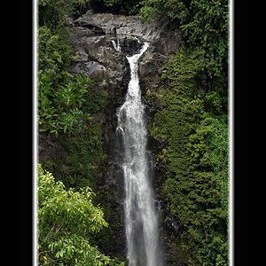
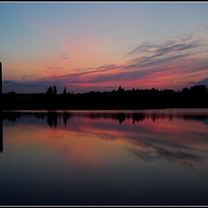
At this point the question I have to ask is, do the last three I've posted (including this one) work as a miniseries (for those who have seen all three)? I'm not trying to hog the forum (I apologize if I AM...) but I wanted to present each in it's own form for your review including this one - again, any technical or aesthetic critique of this image is always welcome.

Leica IIIc, 50mm, HP5 B&W film.

Tuna

IceCreamStalkers235.jpg
 
To dark. You need the darkest dark and the whitest white. Theres alot of the darkest dark but not enough of the whitest white. That sighn is sorta distracting but the clowns are GREAT!
 
warped_baller said:
To dark. You need the darkest dark and the whitest white. Theres alot of the darkest dark but not enough of the whitest white. That sighn is sorta distracting but the clowns are GREAT!

Hi. Welcome to the forum.

It IS a night shot - however pure whites and rich blacks along with a pretty good range of gray tones in between exist on my monitor which I calibrate regularly...

Tuna
 
looks great to me tone wise. if it were a landscape shot, you might want more in depth critique on the tones in the shadows, but this isnt a landscape, or a shot that necessarily needs a certain tonal range (although this mid-contrast level looks great to me). kind of hard at first to decide what I'm looking at at first, but i get a good 'vibe' from it overall :D

the only thing i really dislike is the little stand up sign in the foreground. hard to avoid though, i'm sure. nice job.
 
Excellent!!! The elements are really taking on their own character. For me the lady and her ice cream from a cup steal the show.

The only crit from this end would be the the sign in front. On the other hand it is the streets. Certain things are hard to avoid.
 
Ha, this image totally creeps me out. It's fabulous! :lol:

If life were perfect, you could have snatched away the sign in the foreground and had better symmetry with the chairs under the window. Ah, well. Life is seldom perfect and this image does just fine with what you had to work with. :thumbup: Good stuff!
 
Nice. Would be nice to get more detail in the brick and such, but I think the creepiness of it allows you to get away with a lot. I'm starting to wonder about where you hang out, though. :)
 
I love it, I just wish I could go kick over that sign... whoever put it there should have known that it would be blocking the perfect picture. ;)
 
I think the darkness reflects well, what seems to me, to be a slightly sinister atmosphere with this picture. The two maniquins (creepy things) in the window seem to look on mockingly at the woman eating her ice cream, oblivious. They look like they are hatching a plan to get her or something.

Very creepy... like it!
 

Most reactions

Back
Top