The second one is good. The only two things I notice is the reflection in the middle which draws my eye straight to it and the horizon is a little too centered for me. It's beautiful scenery and I like the gyser or whatever the steam is coming from.
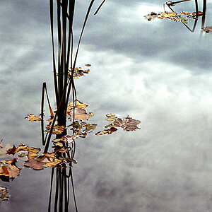
Bahhhh....you dont just take a photo of clouds, that is the ones that are ordiany, like this one. You only take photographs of clouds when they look interesting about them.
Both are obviously gorgeous scenery. I really like the sky in the first one and I know you probably wanted to show the dark blue part of the sky as well as the turqoise. It's just not balanced the way it is though. Try cropping enough off the top to get rid of the darker blue and maybe a little off the left side as well. See if the balance of the picture doesn't feel better to you.
The second one has some great potential I think, again absolutely beautiful scene. You need to clone out the window reflection or whatever that is in the middle. You also need to burn in (darken) both the sky and foreground snowy areas. That way you can bring up the brightness and color saturation of the picture without blowing out the top and bottom. That should make the main middle part pop a little more.


![[No title]](/data/xfmg/thumbnail/36/36659-4b8fd1b317df0e73ccfe5775494a6f5a.jpg?1619737675)
![[No title]](/data/xfmg/thumbnail/34/34130-336ba02cc837fdcc84b79f822e841df2.jpg?1619736301)

![[No title]](/data/xfmg/thumbnail/37/37617-2a07b7e10a8d9f154e8cd9727551e0ef.jpg?1619738151)
![[No title]](/data/xfmg/thumbnail/37/37616-5e9d06af384cf745ad31a513e49183a9.jpg?1619738151)