What's new

I'd really like some c&c on these please

Lacey Anne

TPF Noob!
Joined
Mar 6, 2008
Messages
709
Reaction score
0
Location
WA state
Can others edit my Photos
Photos OK to edit
Three from my last trip to the beach.

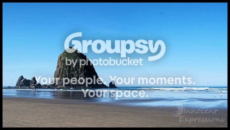
#1 I'm not sure about this one...
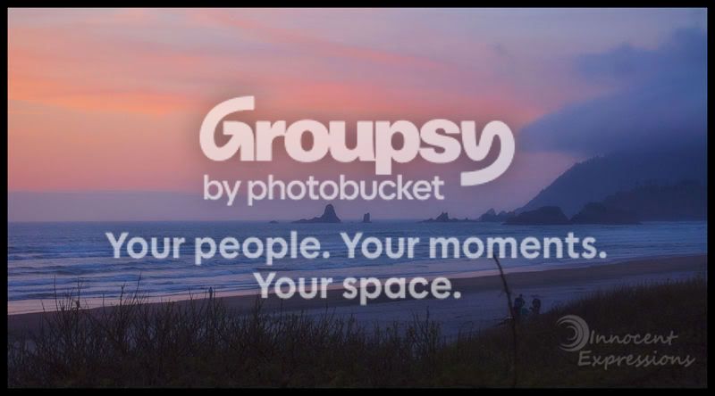
DSC_0482.jpg


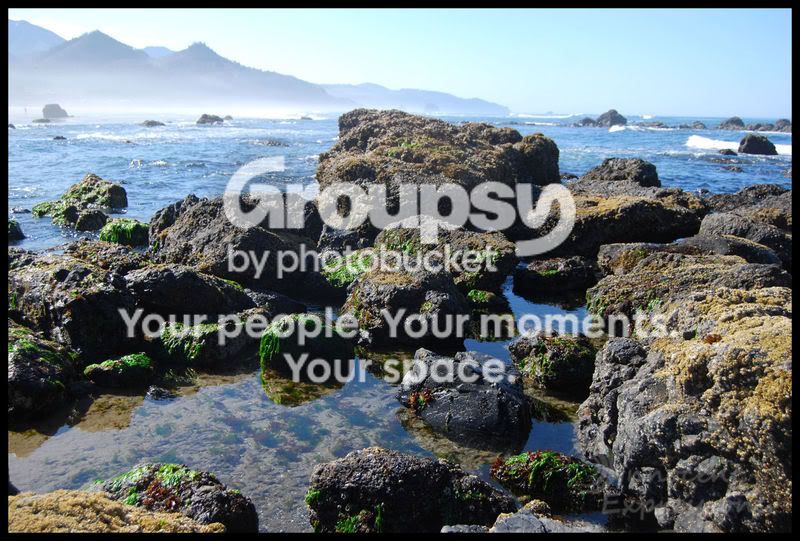
#2 I think I really like this one...
DSC_0263-1.jpg


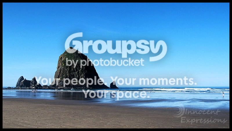
#3 This one is my favorite...
DSC_0319-1.jpg


All right, tear them apart please. I won't be offended, I want to learn.
 
#1. Nice image, could do with a contrast boost (using curves is preferable), but also lacks a strong focal point.

#2. looks better than last time now you've cropped it, and is the strongest of the three. :thumbup:

#3. A bit too much glare causing lack of contrast and leaving it slightly 'washed out'... good effort tho.
 
#1 - Nothing draws me in to the picture.
#2 - Good compostition. Could use some color enhancement. Best shot.
#3 - Too bright and blown out on the top.

How about this for the 2nd shot.

DSC_0263-1.jpg
 
Nice shots.
1. Would like to have been there to see that color
2. My fav...love the framing with the crop
3. good pic, just the focal point seems wrong to me.
 
#1 - Nothing draws me in to the picture.
#2 - Good compostition. Could use some color enhancement. Best shot.
#3 - Too bright and blown out on the top.

How about this for the 2nd shot.

DSC_0263-1.jpg
No offense, but I don't like what you did with this at all. It looks fake.
 
#1. Nice image, could do with a contrast boost (using curves is preferable), but also lacks a strong focal point.

#2. looks better than last time now you've cropped it, and is the strongest of the three. :thumbup:

#3. A bit too much glare causing lack of contrast and leaving it slightly 'washed out'... good effort tho.
Thanks. I can always count on you for excellent c&c!
 
Nice shots.
1. Would like to have been there to see that color
2. My fav...love the framing with the crop
3. good pic, just the focal point seems wrong to me.
Thanks. I appreciate the c&c!
 
I like these a lot - 2 & 3 are my favorites. 3 is a little overeposed IMO.
 
nice captures...here's my lil take on it..hopefully you like it better than the other edit attempt haha
DSC_0263-1.jpg
 
Hey, was bored so I gave it a shot for you.
I just played with the levels a bit I think the water looks better.

DSC_0263-1-1.jpg


I also tried to bandage the dots from the dust on your sensor.

Cheers,

Adam
 
Mathias13, that's exactly what I would have pictured for an improvement... I knew there was something that i didn't like about the 2nd picture but couldn't put my finger on it. Looks like a WB issue which looks like it has been solved in this edit. Lacey Ann... the second it is the best of the two because of the comp and coloring. I second everything the arch says.
 
nice captures...here's my lil take on it..hopefully you like it better than the other edit attempt haha
DSC_0263-1.jpg
I do! lol! Did you just adjust curves? Do you mind sharing what you did?
 
I really like number 2 after that edit. It has a lot of pop and really stands out.
 

Create an account or login to comment

You must be a member in order to leave a comment

Create account

Create an account on our community. It's easy!

Log in

Already have an account? Log in here.

New Topics

Back
Top Bottom