What's new

Illustrated

PixelRabbit

A naughty little bunny...
Joined
Nov 28, 2011
Messages
6,593
Reaction score
3,719
Location
Ontario
Can others edit my Photos
Photos NOT OK to edit
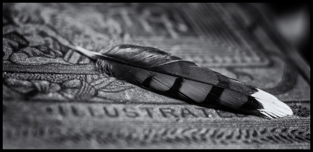
Playing with a bluejay feather and an old book.

Would love to hear your thoughts, thanks for taking a look!

 
I like it, but I'd also love to see it in color.
 
Not sure about illustrated being out of focus
 
Are you lensbabying this, or rotating it? Or just adding blur in post?

To my eye the effect is that the feather doesn't feel like it's in the same picture as the background. It feels composited in, somehow. I can't decide if that's a good thing or a bad thing, possibly because the technical peculiarities are making it hard for me to see the *picture* here. Gonna have to noodle on this a bit. It's definitely interesting.
 
I like it, but I'd also love to see it in color.
Thanks Snowbear, no you don't, it's horrid ;) the book is kinda an ugly colour and while brown and blue look awesome together I can't get it right in the colour version of this, I've shot the book a few times to no avail, I DO have a huge white feather that is on the docket to shoot so perhaps I will get away with colour with that one ;)
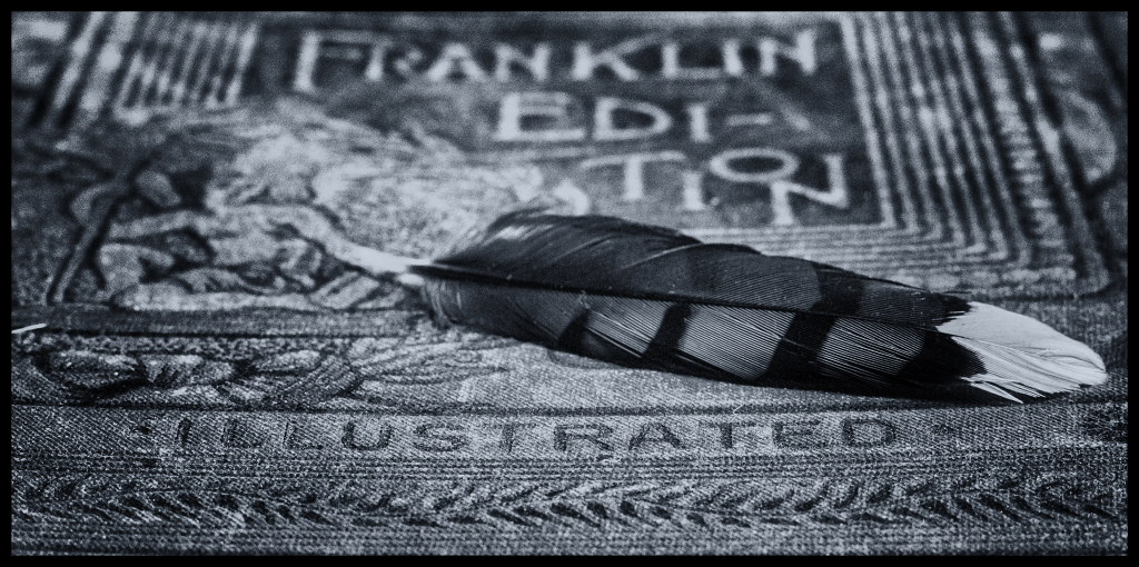
Not sure about illustrated being out of focus
Thanks Gary, this is another version with it in focus, better?


Are you lensbabying this, or rotating it? Or just adding blur in post?

To my eye the effect is that the feather doesn't feel like it's in the same picture as the background. It feels composited in, somehow. I can't decide if that's a good thing or a bad thing, possibly because the technical peculiarities are making it hard for me to see the *picture* here. Gonna have to noodle on this a bit. It's definitely interesting.

Nope no lensbaby ;) Just playing with my old FD mount 50mm with a bare adapter so my focus to infinity is gone and I have a very shallow working area. This is rotated a smidge but not much.
 
Thanks Gary :)
I like them both for different reasons, both centered around the person top left, the second one I like the textures and it feels balanced and shows off the book nicely, the person is resting comfortably. In the first one I wanted to create some tension between the top left and the feather and make it look like she is holding the feather and it has some weight. My biggest wish in the first one was a little more room top and left around her.
 
I like the first one better for the white tip of the feather, yet the second better with more in focus. They both have that vintage look.
 
looks underexposed... isn't that feather tip supposed to be white?
 
It is OK. I'm not into still life too much.
 

Create an account or login to comment

You must be a member in order to leave a comment

Create account

Create an account on our community. It's easy!

Log in

Already have an account? Log in here.

New Topics

Back
Top Bottom