What's new

I'm going to get this landscape stuff down pat

KevinPutman

TPF Noob!
Joined
Apr 13, 2011
Messages
545
Reaction score
19
Location
Nebraska
Can others edit my Photos
Photos OK to edit
1
5jxlaw.jpg


2
grawrssdfdsa.jpg


3 I know this one's really plain, but I feel it doesn't look too bad.
hmmmmm.jpg


4
meow.jpg


5.
spider.jpg
 
I'm in love with the first one
#4 i like, but i feel the rocks should be lighter.?
#5 freaks me out haha.
 
HOLY ***T!!! Giant alien spiders are invading!!!!!

Nice job :thumbup: Defiantly see the improvement.

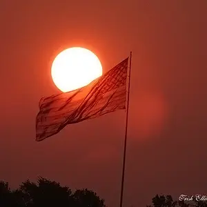
#1 BUENO! but fix the horizon...

#2 Fix your frigg'n horizon!

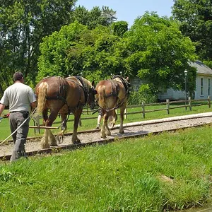
#3 Its nice but trees need to be sharper to work

#4 Like the composition, mind if I take a crack at PP?
 
Last edited:
hahaha giant flying alien spiders!

sure, go right ahead ^-^
 
Here's what I came up with... I tried to bring the rocks in the foreground out a little more, put a little more detail in the clouds around the sunset, sharpened the tree line & tightened the crop a bit. I think it balances better. It's a bit noisy though...

 
What do you mean by fix my horizons? I took all of them into PS, and they're all straight.
Reason they may look otherwise is the actual curvation of the land, or maybe my lens/camera makes them seen curved? I've read something about it somewhere.


you prolly woulda done better on your version if I would have shared the original before I tried any PP =p

All I really do when I PP is crop(rarely), and play with my brightness/contrast.
 
#1 (just a little) and #2 (noticeably)slope up from right to left. It's not the curvature of the earth. The earth's curvature barely begins to show at a min 7 mile span. You're not covering enough horizon for it to slope uphill from one end to the other. You would need to shoot from over 60,000 ft to get that to happen...

What are you using as a reference in #2 to level?
 
The horizon's look ok to me but they are pretty much center of the shot except the giant spider one.
 
The horizon's look ok to me but they are pretty much center of the shot except the giant spider one.
I've been told that that rule wouldn't apply to an image, such as #3, because of the reflection of the treeline..
shouldn't the same apply to images that have a subject?
 
Did some playing around with PP, comments?

2wnve5d.jpg


asdfsadsf.jpg


hmmmmm.jpg


grawrssdfdsa.jpg
 
The horizon's look ok to me but they are pretty much center of the shot except the giant spider one.
I've been told that that rule wouldn't apply to an image, such as #3, because of the reflection of the treeline..
shouldn't the same apply to images that have a subject?

Rules are not laws. As such, they don't have to be followed. Reflections and images with reflective symmetry look great when RoT is broken. But that doesn't always have to be the case. Try it both ways, see what you like better. The important thing is to stay out of the box with regards to "rules." Once you understand the rules, and why they are rules, you can break them to make for pleasant composition. But don't ever be bound by rules. You're the artist. The rules can help, or hurt your work. The trick is knowing when to use them and when to break them.
 
The important thing is to stay out of the box with regards to "rules.
Actually, I would say just the opposite applies, if you want your images to have broad appeal.

Venturing outside the box rarely foments broad appeal, as visual artists have discovered over the last couple of centuries. Guidelines cannot effectively be disregarded without reason. In other words, the justification for disregarding a guideline is in large part based on why the guideline exists in the first place. If you do not have a well grounded understanding of the guideline, it's unlikely you be able to subvert the guideline effectively. When a guideline is ignored just for the sake of ingoring the guideline, the resulting image usually looks like poo.

The guidelines of visual image composition are also based on some logical precepts and esoteric truths.

The larger an image element is, the more visual weight it has.
An unbalanced image is less pleasant to look at, as a balanced image.
Complimentary colors are more logical and pleasant to look at, than discordant colors.
Horizontal lines foster a feeling of stability and tranquility.
Vertical lines foster feelings of strength and dominance.
Diagonal lines foster a sense of movement and motion.

There are many more.

Good composition is usually the blending together of several guidelines.

In fact, all of these compositional suppositions are also used in graphic art, not just photography.

 
Last edited:
The important thing is to stay out of the box with regards to "rules.
Actually, I would say just the opposite applies, if you want your images to have broad appeal.

Didn't really want to get into a philosophical debate on the merits of "Strict Adherence to the Rules" vs. "Doing what feels right." I suppose I could have written that statement better. Had spent the previous 3 hours working on classwork, and studying for a final, and it was way early for me (Alaska time, and all). Rules are good, but for every rule out there, I can probably show you 100 exceptions. The rules work 99% of time. But it's that 1% of the time that if you had simply broken it, you would have had an awesome photo instead of just a good photo. If you remember the debates I had in the past, I was hard lined against rules (specifically RoT). I've softened my opinion on them recently, and realize that they are well known rules for a reason. However, it doesn't mean that you have to follow them 100% of the time. It's that 1% that separates good photographers from great ones.

And if you're wondering, I've taken art history classes that went a lot into compositional techniques. I understand how these things work. I will never tell someone to avoid a guideline for the purpose of avoiding a guideline, unless it's in an educational setting to say, "That's why we follow (or don't follow) that guideline in this situation." That is what separates beginners from amateurs. Beginner's unwittingly break the rules, and their photos suffer. Amateurs (well, more so than beginners) purposely break rules on occasion, and their photos benefit. Re-reading my post, I realize that I am ambiguous at best, and flat out for breaking rules for the purpose of breaking rules at worse, and I apologize for my brain fried posting.

Bottom line, I agree, breaking rules for the sake of breaking rules is bad. Breaking rules to show a beginner why the rules are there in the first place (as I was suggesting to the OP, though didn't explain it well enough) is a good learning experience.
 
I actually like your originals over the edits.

#1 is fantastic, good job!

The others still seem 'ok' to me, but nothing striking. Good job on not clipping the stems off in that one image though
 

Create an account or login to comment

You must be a member in order to leave a comment

Create account

Create an account on our community. It's easy!

Log in

Already have an account? Log in here.
Back
Top Bottom