What's new

improving my style

photocist

TPF Noob!
Joined
Oct 21, 2010
Messages
605
Reaction score
57
Location
Oakland, CA
Can others edit my Photos
Photos OK to edit
I have noticed a general lack of interest when I post photos for critique, though maybe I have not been specific enough about the critique I would like. I am wondering if what people think o my development as a photographer, how the images I produce can be improved by eliminating distracting elements and directing the eye where I want it to go. I am focusing on elements such as line, point, and plane (based on Kandinsky's interpretation).

Here are a few shots that I have taken recently. Do people find them interesting? Are there good uses of line, point, and plane? Does the composition create a mood?
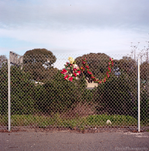

memories by Hoxie Photography, on Flickr
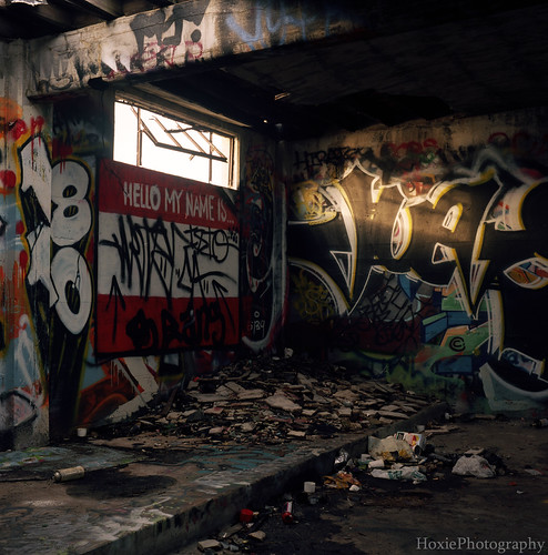

hello my name is by Hoxie Photography, on Flickr

These are a few of the many. Thanks for any feedback!
 
I think the top photo, of the fence and the memorial wreaths, is actually pretty well composed within the square frame. It reminds me very much of the modern, urban landscape movement that first showed itself in the 1970's; this photo could easily be in cluded in several of the shows and books that define urban landscape photography. The subject matter, compositional rigidity, and the spartan nature of the scene are all really quite good, and of a well-accepted style.

The second shot is less compelling to me, mostly because the lighting appears so bland and mundane. The subject matter really doesn't speak to me. It's executed "okay", but there is a lacking, an emptiness, to it.
Thanks for the reply! Something that seems to come up often is that emptiness you talk about. Can you think of anything that would remove that feeling? Maybe if I had a model / subject standing there? Or maybe the subject at the moment is simply not all that exciting.
 
What feeling are you looking to achieve from the second shot?
 
Well, now that I think about it, the feeling was abandonment, emptiness, or even showing something that is broken down, yet still used by people. something to that effect...
 
The second one gave me a sense of abandonment. I think an HDR would change that but I'll bet it would look interesting. That light source from the window is a bit harsh. I wonder if you could tone that down.
 
If you think your photos are missing something? Get closer........

I disagree HDR would be the thing for #2, but would agree some strobed light, light paint, light painting, or exposure blending so the sky in the window wasn't blown-out would help.

On reflection, the lighting in #1 is pretty mundane to.
 
Thanks for all the great feedback!

So far it seems to be mostly the lack of dramatic/ interesting lighting. These shots were on film, so the exposure blending type stuff would be a little more difficult, and costly. It might be time to think about investing in some sort of flash or strobe....
 
For me #1 is too hard for me too look at, I have a problem looking at chain link fences anytime so it has little to do with your shot. I liked #2, to me it seems depresed, my focus was brought to the name tag on the wall, surrounded by all the graffiti it seems just very depressed and lost, I personally think the light from the window adds to the feeling of depression because it's harsh.
 
Here is another shot from the same rolls of film. Does this one have that flat lighting which really takes away from the effect? Is the "missing sense" not there in this shot?


billy by Hoxie Photography, on Flickr
 
Actually I kind of feel like some of your "problem" is not being close enough. #1 is just too much happening. If you were to retake this shot, get closer to those wreaths. I actually like #2 fine by itself and the goats are better with being closer to the fence. I was looking through your flickr and it seems like filling the frame more with what's important might help you.
 
#1 doesnt really do anything for me, the flowers are so small I didnt notice them at first and it was kind of dull.
#2 Ive seen shots in locals like this where they provide / use a lot of moody lighting (sometimes HDR) to get the mood they want. If you lit this location differently I think you could get that.
 
I think you need to do a little research on this search string: " New Topographies: Photographs of a Man-Altered Landscape" . That will give you some perspective on why your first photograph "works", and why the second one does not work as well. The suggestions toward improving the second shot, including HDR, or creative exposure/lighting,etc, would be in line with keeping the photo an urban landscape image. Adding a "model or something" would significantly change the image, and it would no longer be an urban landscape, but something else...depending on how central the person added would be within the composition.

My complaint with the second photo is that the lighting is so flat over the majority of the scene, and it doesn't reveal much of what all that junk is. It's a small shaft of sunlight coming in through a window, and then 85% of the frame all dark and indistinct. it just isn't giving us much to look at, as shot.
 
#1 is a bit hard for me to look at also. The chain link fence makes my eyes search around the photo. I think if you had gotten a lot of closer to the flowers it could be very powerful.

#2 I like, I think a different angle on the shot would have made it much more "empty" feeling.

Keep it up!
 

Create an account or login to comment

You must be a member in order to leave a comment

Create account

Create an account on our community. It's easy!

Log in

Already have an account? Log in here.

Back
Top Bottom