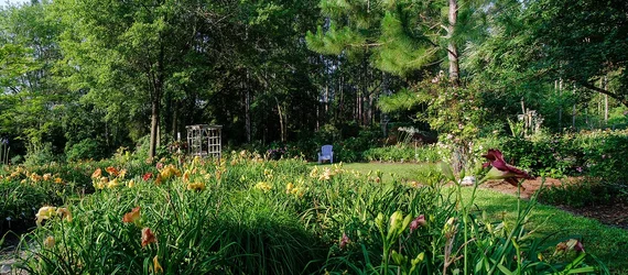
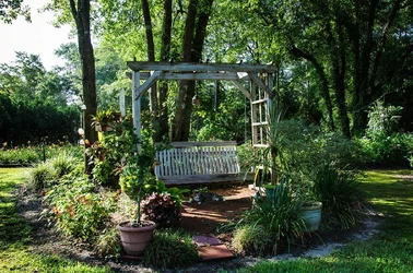
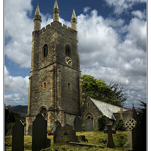
The first one is quite interesting. There is a subject, it's just not clear. I actually think photographers spend way too much time thinking about "subjects" though.
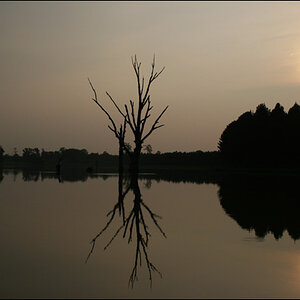
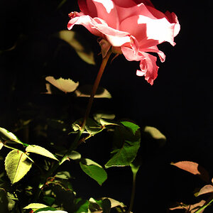
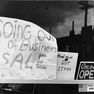
What I would prefer in these is more organization. There's no hierarchy, there's no grouping that I can see. The first has a bunch of stuff in the foreground and a bunch of stuff in the background, and they're actually pretty hard to visually separate, let alone sort into any kind of order of importance. The second one places what appears to be the thing most naturally accorded the greatest importance in the weakest spot, and in a grouping of midrange tonality, while the lesser stuff around is in bright and dark.
These strike me almost as exercises in anti-composition. Either ceeboy is trying something quite subtle that's going over my head, or he's deliberately defying some stuff to see if something can be made of that.




![[No title]](/data/xfmg/thumbnail/42/42329-331b54ea6493a8cdd21d8e624fe97e85.jpg?1734176827)
![[No title]](/data/xfmg/thumbnail/42/42327-560f11a37bb209e9091c0fc9e1028cdc.jpg?1734176820)