What's new

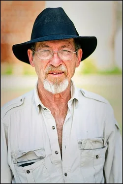
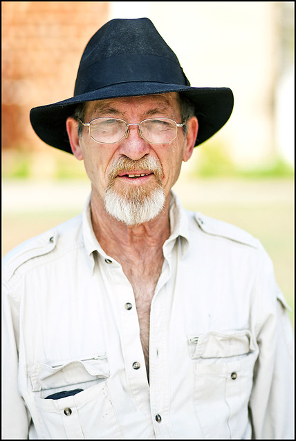
Indiana Jones, Professor Portrait

rexbobcat

Been spending a lot of time on here!
Joined
Nov 28, 2011
Messages
5,014
Reaction score
1,968
Location
United States
Can others edit my Photos
Photos OK to edit
lol I'm actually having a lot of fun just randomly walking around and asking interesting people if I can photograph them.

He's a professor in geography here at my university, and I saw him walking into his office the other day while I was out photographing people for a "diversity" project. Maybe I just don't get out enough, but he reminded me of Indiana Jones somewhat and it seemed odd to see someone in this area wearing that style of hat.

 
Last edited:
lol I'm actually having a lot of fun just randomly walking around and asking interesting people if I can photograph them.

YES! Props for that! Random people photographing! The dude looks interesting, alright. His shirt seems overly bright though, and since it's so much of the picture area, it's really competing with his face. Maybe a bit of darkening-down on the shirt would make this look m ore balanced. I think this image would look quite good as a B&W. I wonder how this might look with a narrow,dark border around the image...some images desperately NEED a border, to contain them...most often images that have a lot of light subject matter at one edge...the border helps to keep the eye restrained, and forces the eye to go "back into the picture" so to speak, when the border is hit as the eye moves around the picture. At one time, we used to laboriously HAND-APPLY "hairline border tape", up to 3mm or even 4mm black border tape around images for publication, back in the days of paper-and-wax paste-up.
 
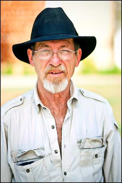
How does that look? I burnt his shirt a little bit to bring the brightness down and to make more of the darker details pop out, and I added a black border.


I think it's also because the forum has a white background, so it kind of blends elements of the image in with the background. I didn't want to add too heavy of a border because I don't want people to be like "oh look at that photo...and that border around it!" Heh...
 
Good for you for being able to photograph strangers like that. We often see a lot of posts from (young) people who can't find anyone to pose for them, mostly because they are too timid to just ask. All the best portrait photographers that I've met, are very outgoing and have the ability/stones to just walk up to someone and ask to take their photo.

This is a decent portrait of an interesting looking character. He does have that Indiana Jones vibe going on. I'm not sure about the dress code around there, but he seems to have a few too many undone buttons for a professor, but at his age, he probably doesn't care and the administration probably doesn't have much sway with him (maybe I've seen too many movies).

I didn't see it before the frame, but it does look good. I can see that it would be better with, than without. I'd also try a soft vignette, which is another really good way of constraining the viewer's eye, as Derrel mentioned.
 
Yes, the hairline border you've added since the original post and my first reply to it was made, does help! BigMike's suggestion of a vignette is also a good one...as long as it's subtle...with that much of that light-colored khaki shirt, a vignette would need to be applied carefully, and subtly. Honestly? I think the shirt is still a bit too light, in the image I am looking at "currently". It's just drawing my eye away from the man's face...it's one of those light advances, dark recedes kind of things, ya' know? On my monitor the chest area looks very close to blown-out...it's simply "too hot", and that is causing his shirt to "read" as a highlight.
 
How about now? I'm trying to get this right. I'm one of those people who thinks something looks great and then I walk away for a few hours, come back and say "oh god what the hell?" So I'm probably not viewing it as objectively right now lol
 
I made a quick edit, just to see if my theory would work. I may have gone a touch too far, just for sake of demonstration.
$Prof.webp

Also, I noticed (when I downloaded it) that it had an embedded color profile of AdobeRGB. That's all well and good for editing, but most/all internet browsers can't interpret it properly, they only read sRGB...so you have to make sure that you convert/assign it to sRGB before uploading. Sometimes is makes your colors go wonky.
 
How about now? I'm trying to get this right. I'm one of those people who thinks something looks great and then I walk away for a few hours, come back and say "oh god what the hell?" So I'm probably not viewing it as objectively right now lol

QFT on that!!!!

Quoted For Truth!!! Yeah, ain't that the truth. been there. Agreed, totally! I have processed entire session's worth of shots, and then come back in 1 or 2 days' time and thought, WTF was I THINKING!!!!!!!! I thought THAT white balance looked good? or, "What in the hell was I thinking on that SKIN tone? GACK!"
 
Big Mike said:
I made a quick edit, just to see if my theory would work. I may have gone a touch too far, just for sake of demonstration.
<img src="http://www.thephotoforum.com/forum/attachment.php?attachmentid=20040"/>

Also, I noticed (when I downloaded it) that it had an embedded color profile of AdobeRGB. That's all well and good for editing, but most/all internet browsers can't interpret it properly, they only read sRGB...so you have to make sure that you convert/assign it to sRGB before uploading. Sometimes is makes your colors go wonky.

What did you do? Change the color space and darken?
 
I used the burn tool around the edges to darken them, thus making the face stand out a bit more. Then when I saved, I assigned it to sRGB and uploaded it. Not sure if there was much difference to be seen in the color space change though.

Mostly, I just wanted to give it a vignette, to help constrain the viewer's eye to the face of the subject. Did it help?
 
It helps. For working off of an 8-bit JPEG,not too shabby there, Big Mike!
 
The color space change made the colors a little bit darker, but since the photo was already bright it looks good.

Yeah the vignette does help constrain the viewer's eyes better. I think that maybe on yours it is a little bit strong, but I did add it just a little bit around the edges. It's another one of those things where I don't want the viewer to automatically say "wow, what a vignette." lol I updated the second photo in my original post.

Tell me if you think the vignette is too weak or not. :)
 
It helps. For working off of an 8-bit JPEG,not too shabby there, Big Mike!
And I was using Photoshop CS (an old version) with rudimentary burn & dodge tools. The newest versions have improved the way burn & dodge work.

Tell me if you think the vignette is too weak or not.
It's certainly an improvement over the original. I would think you could go a little stronger with it...but yes, there is a line that you usually don't want to cross, where the viewer starts to notice that there is an artificial vignette going on.
 
One more edit lol
 
I feel the indy theme. he was a professor too.
 

Create an account or login to comment

You must be a member in order to leave a comment

Create account

Create an account on our community. It's easy!

Log in

Already have an account? Log in here.

New Topics

Back
Top Bottom