What's new

Indoor shoot

ewick

TPF Noob!
Joined
Dec 12, 2011
Messages
464
Reaction score
74
Can others edit my Photos
Photos NOT OK to edit
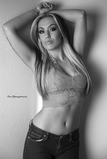
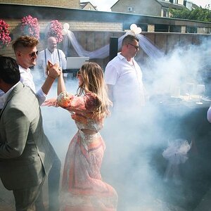
Just one of the shots from this photoshoot. I was going to post it in the Proffesional section but I don't think getting paid in layers count. C&C is always welcomed.

8442123578_719b0336dd_z.jpg
[/URL] Angelina by EricJimenezPhoto, on Flickr[/IMG]
 
Its a nice shot, very well lit, and a lovely model, just I think a lil higher of a angle might of worked better.
 
Did you use umbrellas to shoot this by chance? If she's wearing white, or I'm shooting an area with large white areas, I tend to underexpose (in RAW of course) so that I can see some shadows of the fabric, otherwise it looks like a large white mass (as it somewhat does in this shot.)

I agree with Graham on the angle as well.
 
Did you use umbrellas to shoot this by chance? If she's wearing white, or I'm shooting an area with large white areas, I tend to underexpose (in RAW of course) so that I can see some shadows of the fabric, otherwise it looks like a large white mass (as it somewhat does in this shot.)

I agree with Graham on the angle as well.


I used a speed light diffused pointed at her and a ring flash aimed at the room behind her and a large soft box aimed at her to create separation. Recently I been learning from a very talented and established photographer friend of mine and so i am changing my style. I used to shoot "fat" but now I am shooting more of 3 quarter and tight. Thank you for your input though.
 
Here is another one. Rather than start another thread I thought I would just add to this one. I appreciate comments regarding posing and lighting.


IMG] angelina by EricJimenezPhoto, on Flickr[/IMG]
 
The first one, IMO, is not lit very well. It almost looks pop-up flashy. Also, the illumination of the background and the busy-ness created by it is quite distracting. Especially the hard edges of the OOF area on the blinds. It looks more like a snapshot than a model shot.

The second one is better. Lighting and shadows are more dynamic, however it's kind of a cliche pose and composition. But it WORKS better because the background is less distracting. I feel that a midriff and up crop would have made it stronger. Mainly because the darkness of the pants is quite overwhelming when compared to the tonality of the upper portion.

Just my thoughts. Keep it up! :thumbup:
 
b&w pic is a lot better i agree with ^^^

me personally i would have messed around with the levels/curves made the blacks and whites stand out more added some drama (looks like to me you just pushed the desaturate option in PS)

nice model btw like her tattoo on her wrist
 
The first one, IMO, is not lit very well. It almost looks pop-up flashy. Also, the illumination of the background and the busy-ness created by it is quite distracting. Especially the hard edges of the OOF area on the blinds. It looks more like a snapshot than a model shot.

The second one is better. Lighting and shadows are more dynamic, however it's kind of a cliche pose and composition. But it WORKS better because the background is less distracting. I feel that a midriff and up crop would have made it stronger. Mainly because the darkness of the pants is quite overwhelming when compared to the tonality of the upper portion.

Just my thoughts. Keep it up! :thumbup:

I was making do with what I had. I didn't want to give her just plain backgrounds. I know its busy but c'mon you mean to tell me your eye goes straight to the "busy background" before the actual model? I will take your post with a grain of salt. Thanks for taking the time to give me your input.
 

Create an account or login to comment

You must be a member in order to leave a comment

Create account

Create an account on our community. It's easy!

Log in

Already have an account? Log in here.

New Topics

Back
Top Bottom