What's new

Interesting Daffodil Photo C&C Welcome.

tommmkelly

TPF Noob!
Joined
Mar 30, 2013
Messages
28
Reaction score
2
Can others edit my Photos
Photos OK to edit

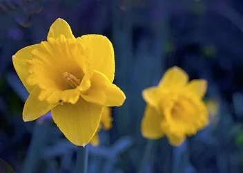
More Daffodils by Tom Elliott Kelly, on Flickr


I liked the way the stems looked blue in the twilight, I wish the main flower was a little bit more in focus but that might just be me.

Let me know what you guys think!
 
I personally don't like the blue tone. Of course, I really like warm photos and have had to learn not to overdo that. ;) I might crop closer and get rid of some of the other flowers. I find myself bouncing between them because they're blobs of bright colors.
 
I personally don't like the blue tone. Of course, I really like warm photos and have had to learn not to overdo that. ;) I might crop closer and get rid of some of the other flowers. I find myself bouncing between them because they're blobs of bright colors.

I just thought it was an interesting affect as I didn't make it blue on purpose through editing.

As with the cropping, I kinda like the way my eyes go around in circle looking at the flowers until they reach the in focus daffodil. I suppose the main focus should really hit the eyes first but hey!

Thanks for your comment though! Appreciate the criticism :)
 
I don't have too much of a problem with the blue background as blue and yellow are complementary colours. I just think that there are too many blurred daffodils in the background that detract from the main subject. This "distraction" is reinforced by the fact that blue and yellow are complementary colours. When I shoot flowers, I try to isolate either a single flower or a group of three flowers, keeping all of them in focus. The "problem" with blurred images is that the viewer will spend time trying to figure out exactly what they are, rather than trying to look at the flower that is in focus. If you really interested in flower photography, take a look at some of the work by Harold Davis and Denise Ippolito. HTH.

WesternGuy

 
I don't have too much of a problem with the blue background as blue and yellow are complementary colours. I just think that there are too many blurred daffodils in the background that detract from the main subject. This "distraction" is reinforced by the fact that blue and yellow are complementary colours. When I shoot flowers, I try to isolate either a single flower or a group of three flowers, keeping all of them in focus. The "problem" with blurred images is that the viewer will spend time trying to figure out exactly what they are, rather than trying to look at the flower that is in focus. If you really interested in flower photography, take a look at some of the work by Harold Davis and Denise Ippolito. HTH.

WesternGuy

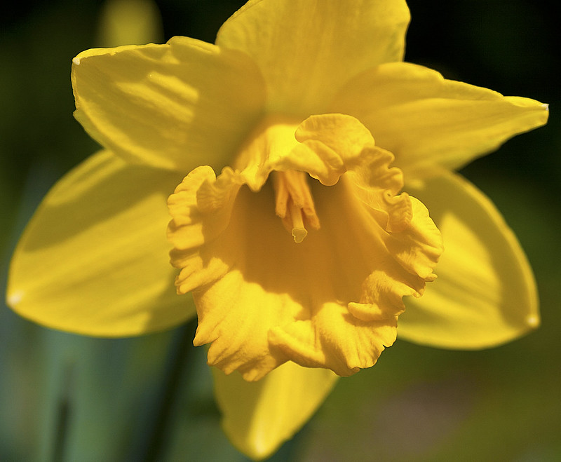
Here is a more traditional flower photo I took of a daffodil.


Narcissus (Daffodil) by Tom Elliott Kelly, on Flickr

Also, on this one I realise that the petals are slightly out of focus :)

I know that there is a big problem with the eyes not being able to find the focus of the image on the previous image but I just thought I would try out something different :)

Thanks for your comment though!
 
$8653429110_caf6dc07b9_c.webp


Changing the crop and removing the extra blurred flowers makes this more interesting.
 

Create an account or login to comment

You must be a member in order to leave a comment

Create account

Create an account on our community. It's easy!

Log in

Already have an account? Log in here.

New Topics

Back
Top Bottom