International Chop Suey

GlendaleViper

TPF Noob!
Joined
Jun 5, 2007
Messages
36
Reaction score
0
Location
Toronto, Canada
Website
www.flickr.com
Can others edit my Photos
Photos NOT OK to edit
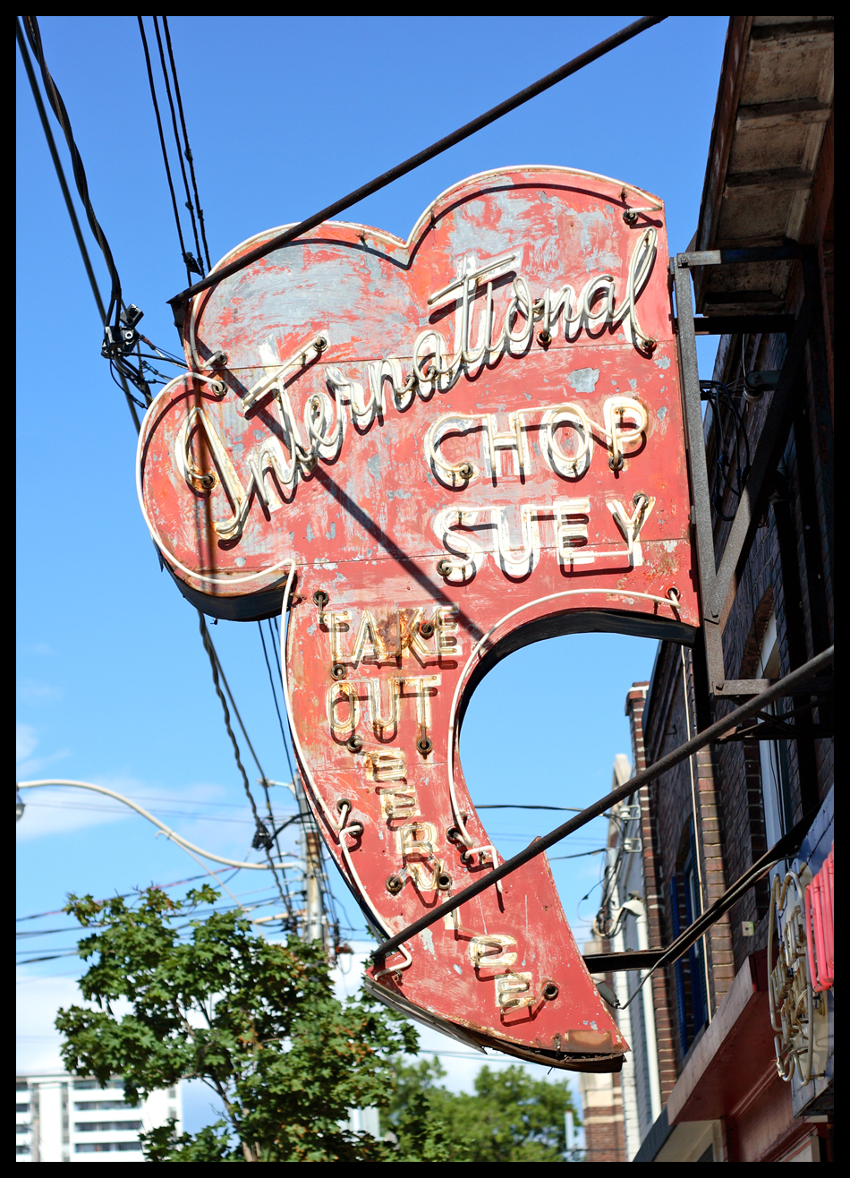
Hey everyone,

I'm starting a photo essay on the communicative nature of signage. I'll be focusing on older signs like this one, since the character and care of the sign ultimately says something as well.

First one here, shot yesterday on Kingston Road in Toronto. Taken with Canon 30D, EF 50mm 1.8 @ 1/1600 and 3.5. Standard in-Raw correction only.

C&C please! I beseech you! :mrgreen:

 
thats a really cool sign, but the shot has lots of distractions in it. if you went back at night maybe some of that other junk wouldn't be as obtrusive. the powerlines don't bother me as much as the tree in the background. even the skyline is proly ok

on a technical level it seems fine though. good sharpness and color.
 
Being a sign guy myself (literally, I work at a sign shop), I wouldn't have mounted the sign that way, but that is definitely an older sign. The braces they use to mount it are obtrusive and created shadows on it which lead to the distractions. Also, by being in the sign business, this definitely appears to be a snapshot. If you go into your local sign shop and look at some of the signs, I bet a lot of the photos will look similar to this. You do have a lot of nice color in it, but perhaps it is a bit over saturated? The sharpness is on spot though as it shows the texture nicely. Did you photograph the other side of the sign? I'm curious as to how that one came out.

Overall composition for the photo....It's okay, but it doesn't really do a lot for me. You're going to need to get creative with some of these shots so that they don't look like snapshots. I am looking forward to seeing the rest of the signage that you photograph!
 
I like your idea on the photo essay of signs.. this could be fun.. Its gonna be hard to find a pristine scene though with a sign.. Always that clutter..wires , cars etc...

This shot , well without those wires , what a find.. but then again, it may just be a part of your essay to show these signs in there natural settings..nothing wrong with that either...

This is a good shot, although the shot shows good saturation on color , the sign seems to not pop.. might be the age and condition?? it just appears a bit washed to me ???

Hey good luck, and also look forward to seeing more signs from you !
 
I think the shot would benefit from an overall curve adjustment. It would bring the red out in the sign and darken the building and sky (reducing the distractions somewhat) and let the sign stand out.
 

Most reactions

Back
Top