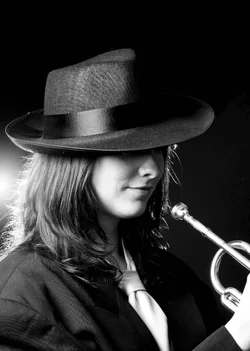
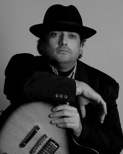
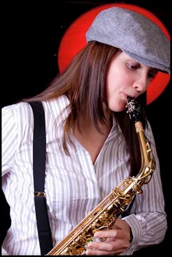
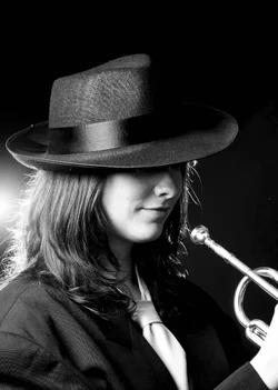
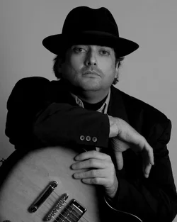
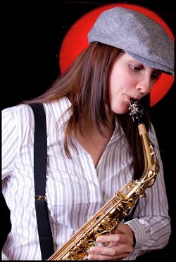
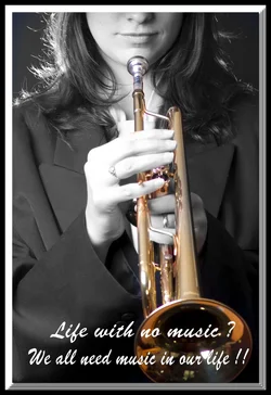
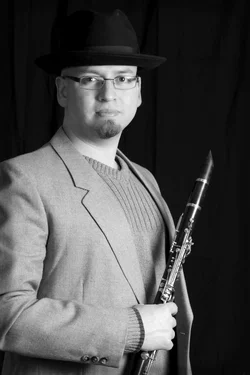
I love jazz. I agree on the crop and feel. On the first one, I would have made it horizontal and included all of the trumpet. On the others except the poster, I would have allowed more space around the artists. I really like to see the whole instrument when it's brass. The poster one is a very stressful crop, too much tension. I am a noob, so take my critique with a grain of salt.




![[No title]](/data/xfmg/thumbnail/30/30866-bdfc426e8ee7e6ad63f6d751c5f288f0.jpg?1734158835)

![[No title]](/data/xfmg/thumbnail/30/30865-3dc03385b0036f80524b0636d0d56f07.jpg?1734158833)
![[No title]](/data/xfmg/thumbnail/30/30864-50861ef77d7fa163bd5f5b5b8d661f5a.jpg?1734158829)