What's new

Just a college student with a camera :)

madisondoppsphoto

TPF Noob!
Joined
Oct 16, 2016
Messages
1
Reaction score
0
934d7b6872a8d7f91f6486622cd7141c.jpg
96d876551730a8195e08f5f2881e9cfc.jpg
a2d1f7d2cf37b37641878c17f714375a.jpg


Sent from my iPhone using ThePhotoForum.com mobile app
 
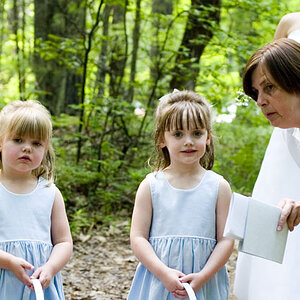
The light direction and quality isn't flattering to the subjects.
In both outdoor shots the subjects have dark eye socket.
Direction & Quality of Light: Your Key to Better Portrait Photography Anywhere
Off-Camera Flash: Techniques for Digital Photographers
On-Camera Flash Techniques for Digital Wedding and Portrait Photography

Lighting ratios
Lighting Ratios for Portrait Photography
Lighting styles

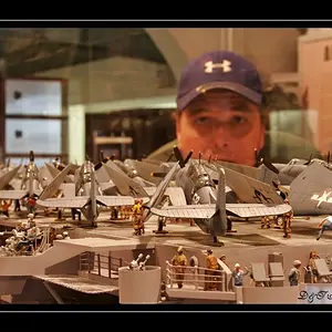
Human eyes are first drawn to bright areas of an image, so in thew top photo the subject winds up having less visual weight, and garners less attention, than the bright background. He seems somewhat out of focus, maybe because his face was just inside the near focus limit of the lens.

All 3 would benefit with some post process editing.
You don't show an edit preference, OK or Not OK in your profile so other TPF members can show you some editing possibilities.
 
Last edited:
I think you show a lot of potential with these. The focus is good and I like the framing. I like the first one a lot it's a very intimate, compelling shot. KmH is right about the bright spots being a distraction but, for me, they do not completely pull my eye away because the subject fills so much of the frame. The 2nd shot I like the pose and the exposure but the alley background too distracting for my taste. The last one is the weakest, IMO, it looks like you caught him mid conversation and no eye contact.

 
The technical stuff is nice, particularly in #2.
#1 is, imo, a very typical I'm a young person in school with a camera shot. Very emo and that gets old quickly.

Great start. Keep on.
 
I agree with the post above.

Welcome to TPF!!! :)
 
Welcome from me, too.
Keep shooting, take on board the advice from some of our experts here: you seem to have what it takes. :)
 
Better than half the stuff on here. I like it. Follow your own aesthetic and refine it. Don't follow the crowd. The crowd is boring. A little fill flash in image #3 might help some. #1 is my fav.
 

Create an account or login to comment

You must be a member in order to leave a comment

Create account

Create an account on our community. It's easy!

Log in

Already have an account? Log in here.

New Topics

Back
Top Bottom