Better to post fewer images for more detailed comments, but here goes.
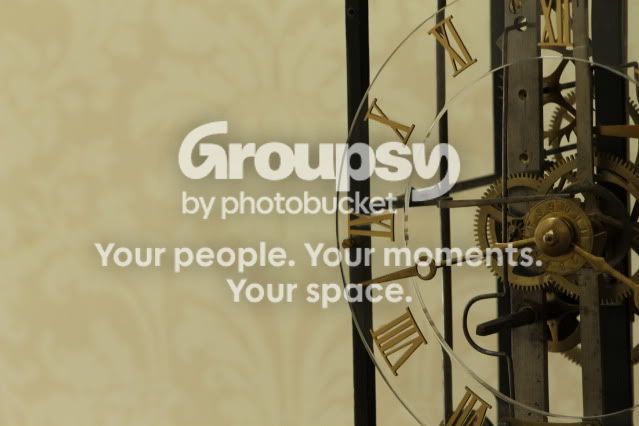
#1 Good that you didn't put the clock dead center, but I think you went too far and included too much background. Also a little dark.
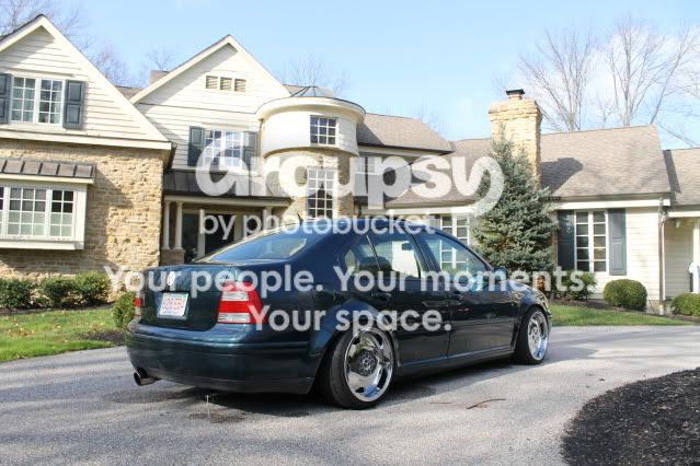
#2 This is more or less a snapshot. If the car is the subject, then it needs to be a larger part of the frame and the house needs to be a little out of focus
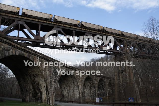
#3 Very nice composition and well exposed. Might have been better to frame a little lower to avoid having that last stone column on the left right at the edge of the frame.
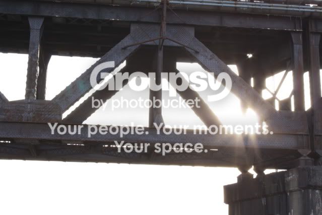
#4 Flare from the direct sunlight reduced the contrast and the washed out sun doesn't do much for the image. Composition also could be better, perhaps by including the top of the structure.
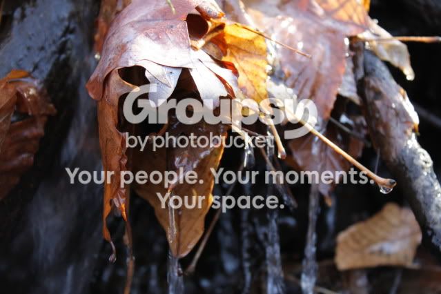
#5 Colors are washed out on the leaves. Needed a polarizer or less harsh lighting.



![[No title]](/data/xfmg/thumbnail/40/40300-583eaa43665714005823e12314084a4d.jpg?1734174710)



![[No title]](/data/xfmg/thumbnail/41/41796-690c109012575e084970902dbd3894ba.jpg?1734176108)
![[No title]](/data/xfmg/thumbnail/41/41797-ed370d68dae70f5b0a7252ec2d525912.jpg?1734176109)