412 Burgh
No longer a newbie, moving up!
- Joined
- Mar 18, 2011
- Messages
- 1,414
- Reaction score
- 192
- Location
- Pittsburgh
- Can others edit my Photos
- Photos OK to edit
1.

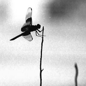
ZMD_2906 by ZDiBeradin, on Flickr
2.

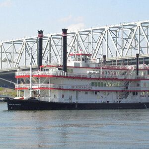
ZMD_2899 by ZDiBeradin, on Flickr
3.

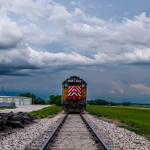
ZMD_2850 by ZDiBeradin, on Flickr
ZMD_2906 by ZDiBeradin, on Flickr
2.
ZMD_2899 by ZDiBeradin, on Flickr
3.
ZMD_2850 by ZDiBeradin, on Flickr




![[No title]](/data/xfmg/thumbnail/34/34116-b81991a4a8a532509a981cadbacd573c.jpg?1734164576)
![[No title]](/data/xfmg/thumbnail/30/30881-c36788e79b12973b7bf57c94b46961e9.jpg?1734158883)

![[No title]](/data/xfmg/thumbnail/32/32711-b57dd72845f94aa34b3bd7207b07f98c.jpg?1734162320)
![[No title]](/data/xfmg/thumbnail/37/37602-1ef8dbb1c2d0e4ff347ee65d328c3603.jpg?1734170730)

![[No title]](/data/xfmg/thumbnail/34/34115-73b827c6a6db1413dcead11e4caaae69.jpg?1734164571)