paigegreen916
TPF Noob!
- Joined
- Jul 2, 2008
- Messages
- 136
- Reaction score
- 0
- Location
- Southern California
- Can others edit my Photos
- Photos NOT OK to edit
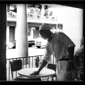
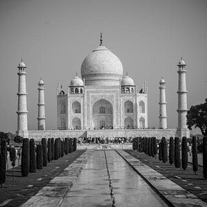
i really like this kind of sideways angle and i think the B&W suits it. just messing around. any tips, suggestions or feedback? (about the photo and the photo only please!!)


![[No title]](/data/xfmg/thumbnail/37/37614-3833b9d2e46075829c91cf9c0f47af69.jpg?1734170740)

![[No title]](/data/xfmg/thumbnail/37/37612-989c0c475619355f32a5941a187cfa74.jpg?1734170738)


![[No title]](/data/xfmg/thumbnail/36/36666-189f65b1addbb68da2a43dc6f7206a01.jpg?1734169172)