hollanfeng
TPF Noob!
- Joined
- Apr 23, 2010
- Messages
- 41
- Reaction score
- 0
- Location
- Ottawa, Canada
- Website
- www.flickr.com
- Can others edit my Photos
- Photos NOT OK to edit
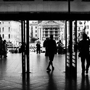
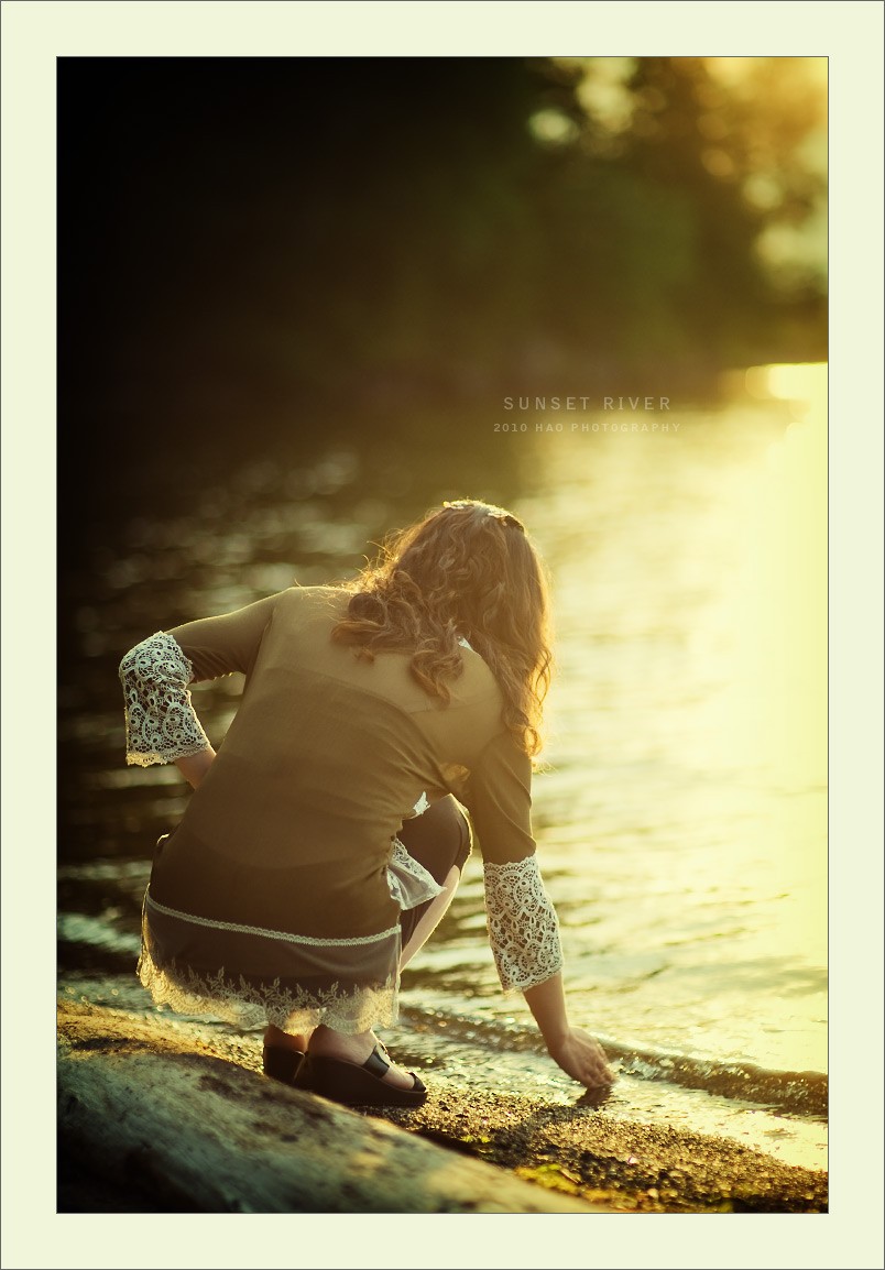
Trying some new styles. C&C are welcomed. Thanks.

Follow along with the video below to see how to install our site as a web app on your home screen.

Note: This feature currently requires accessing the site using the built-in Safari browser.
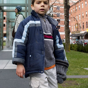
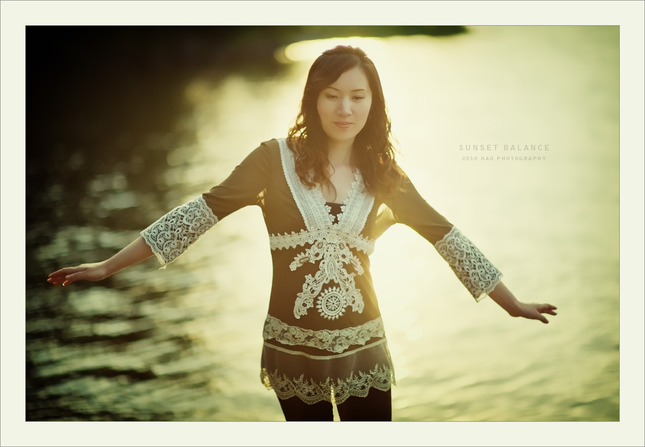
Contre-jour, for sure! These three go together well. In the first shot, I wish the camera had been swung a bit more to the left. Her slightly OOF hand is distracting me a bit--I might be tempted to use the magic lasso and sharpen up the hand and forearm, then fade the sharpening a bit with the slider...I think that would work better. The lacy sleeve is making the DOF transition more apparent than a 'normal' garment would.
I like the second shot, but wish the upper left corner were a little bit brighter; at least dodge the edge of it, nearest the center of the frame; the large,dark triangular shape's overall size is pretty powerful. I like the contre-jour, and again, the lace trim on her clothes really comes into play, and it makes the backlighting stand out well!
The last shot is framed as a horizontal, and properly so, because she has her arms spread out wide!!! The third shot is a perfect example of when to actually orient the camera in the horizontal orientation on a half-body shot!!
Please note: my C&C on these does not really take into account the overlayed captions. With the captions considered, I can understand the excessively large area of green camera right, in shot 1. In shot #2, Sunset River, I think if I were skilled in Photoshop, that I'd be tempted to artificially dodge (lighten up) the highlights on the surface of the river in the area above her left shoulder, just for a bit more attention on the beautiful highlights on the water's surface.
I consider this type of portraiture to be "bokeh work", and it has a lot of appeal to people I think. It's really based on a lot of small details, and the background is one of the areas where you can kind of work on the shots, by selective lightening or darkening, or by cropping out areas. There really is not all that much that is in-focus in this kind of portraiture, so the changes that can be made are usually more concerned with massaging or nuancing the background.
This THIS THIS :thumbup:Looks ok but a little less gamma would help.
")
try harder with better exposure