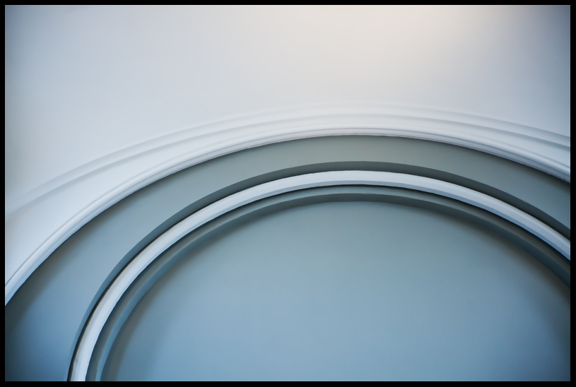
Nice minimalist composition! Perhaps even better if the upper middle were just a bit less bright so the uppermost curve didn't almost fade into the background. It could be just my overly bright imac screen that's doing that.
The color,shape and placement of the arch is wonderful, too bad about the light in the upper middle.
I wonder if you could go back and shoot that again, correcting for the light?
It could also be my screen, still have not corrected my screen yet....
I don't know about this one. The shape and composition is nice, but it's too clean and perfect. Kinda boring. Looks like it's computer generated, or stock wallpaper from Microsoft Windows -- harmless, says nothing, won't offend anybody.
Funny, I really like that bit in the middle kinda fading into the wall. I also like the shadows from several directions contrary to the obvious light source.
White, your comment sums up most landscape photography.