Landscape guy need help/critique with portraits

MikeFlorendo

TPF Supporters
Supporting Member
Joined
May 11, 2014
Messages
401
Reaction score
194
Location
Southern California
Can others edit my Photos
Photos OK to edit
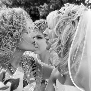
I am a landscape guy but people keep asking me to do portraits. I said I need to work on it first so I started shooting people a week ago. Need critique and help. They look OK to me but I want them to look great not ok. Any help would be appreciated. Let me know if I need to go back to landscapes. :)

#1 needs fill light and less centered, anything else?
Jess10.jpg

#2 Used a reflector but too much?

Angie_Nick_Casper_park1.jpg

#3 Too blown out and centered?

Angie.jpg

#4 Needs fill light.

Jess.jpg

Thanks for any help.
 
Last edited:
#1 watch the background The big dark rock is kind of stealing my eye.

#2 maybe a bit too much, also ask the young man to tuck in the shirt tail

#3 too much landscape and not enough model

#4 darned near perfect, except for needing fill as you wrote watch how close you crop the bottom
 
#1-the warning sign on the rocks is distracting, and the deep,dark blue sky is a wee bit too dark I think. The sky-scape is very strong...but her body positioning is also dramatic. I think this one needs a bit of a re-work in post to make it stronger, which I think can be done by downplaying the sky part a bit, and lightening her up a bit.
#2-I really like the interpersonal dynamic you show in this shot. His missing foot hurts a little bit. The reflector fill is very strong, and the people are very warm-toned, but the background is coolish, which looks a bit 'manipulated'. Still, again, I like the interpersonal relationship this shows, which the subjects ought to like also.
#3-Yeah, your assessment is accurate--too centered, too blown out, just not a good frame. The lighting at the scene is not that good for her. She also looks out of focus, especially on her leg/foot.
#4-A very high degree of realism is created by the way the large rock is shown so well...it shows the nature of the rock in that location, and the subject is framed well by natural world elements. In a way, her feet not showing and the flowing white dress makes her seem angelic, almost floating. A tiny bit of eye-sparkle on this one would have really elevated this shot..the backlighting is very,very strong, and her eyes and face are a bit dark.
--Overall, I think you're doing okay though, and you might become very good at portraiture if you keep at it. These are in some ways just small scale landscapes, with people added.
 
#1 watch the background The big dark rock is kind of stealing my eye.

#2 maybe a bit too much, also ask the young man to tuck in the shirt tail

#3 too much landscape and not enough model

#4 darned near perfect, except for needing fill as you wrote watch how close you crop the bottom

thank you very much! I appreciate you taking the time very good advice-
 
#1-the warning sign on the rocks is distracting, and the deep,dark blue sky is a wee bit too dark I think. The sky-scape is very strong...but her body positioning is also dramatic. I think this one needs a bit of a re-work in post to make it stronger, which I think can be done by downplaying the sky part a bit, and lightening her up a bit.
#2-I really like the interpersonal dynamic you show in this shot. His missing foot hurts a little bit. The reflector fill is very strong, and the people are very warm-toned, but the background is coolish, which looks a bit 'manipulated'. Still, again, I like the interpersonal relationship this shows, which the subjects ought to like also.
#3-Yeah, your assessment is accurate--too centered, too blown out, just not a good frame. The lighting at the scene is not that good for her. She also looks out of focus, especially on her leg/foot.
#4-A very high degree of realism is created by the way the large rock is shown so well...it shows the nature of the rock in that location, and the subject is framed well by natural world elements. In a way, her feet not showing and the flowing white dress makes her seem angelic, almost floating. A tiny bit of eye-sparkle on this one would have really elevated this shot..the backlighting is very,very strong, and her eyes and face are a bit dark.
--Overall, I think you're doing okay though, and you might become very good at portraiture if you keep at it. These are in some ways just small scale landscapes, with people added.


Thank you Derrel! Very good points and I need to work on the light. I love manipulating light but never had to watch shadows on faces. All new to me but yes my landscape stuff helps. I see a lot of people with websites for portraits with crooked horizons ( that don't look intentional). The sign I took out I just posted the wrong photo I saved from Lightroom before I took it out in Photoshop. I like working in Lightroom but need more work in Photoshop. Sometimes I need to take out stuff in hard places. Thanks again this helps me tremendously-
 
While we are at it how are my studio portraits? Is the cropping OK?
#1 Too dark is cutting of the elbow distracting?
Jess1.jpg

#2 I brightened the eyes but is it too much? I turned of the fill and left the main light on for shadows.

Jess2.jpg
 
I'm not a portrait guy but Yes the elbow and the hand are cut off and it's a bit dark for my taste. The pose is cute though.
The second one I like. The face stands out nicely. I'd crop off some of the left side as it doesn't add to the pose for me.
 
While we are at it how are my studio portraits? Is the cropping OK?
#1 Too dark is cutting of the elbow distracting?
#2 I brightened the eyes but is it too much? I turned of the fill and left the main light on for shadows.
#1 yes, too dark, and cropped too tight. Very nice pose.

#2 Also nice pose, but I think the hat needs more definition. I really like the red fabric lower left.
 
I'm not a portrait guy but Yes the elbow and the hand are cut off and it's a bit dark for my taste. The pose is cute though.
The second one I like. The face stands out nicely. I'd crop off some of the left side as it doesn't add to the pose for me.
Yeah I thought so with crop on the first one. Thanks-
 
While we are at it how are my studio portraits? Is the cropping OK?
#1 Too dark is cutting of the elbow distracting?
#2 I brightened the eyes but is it too much? I turned of the fill and left the main light on for shadows.
#1 yes, too dark, and cropped too tight. Very nice pose.

Thanks yeah I thought so i'll watch my cropping and lighten it up. At least I have some good poses. Thanks again-
 

Most reactions

New Topics

Back
Top