What's new

Landscapes and naturals for C&C

Tight Knot

No longer a newbie, moving up!
Joined
Nov 30, 2010
Messages
1,398
Reaction score
159
Location
Boca Raton, FL
Can others edit my Photos
Photos OK to edit
Hi All,

Here are some more, thanks for your input.

1.
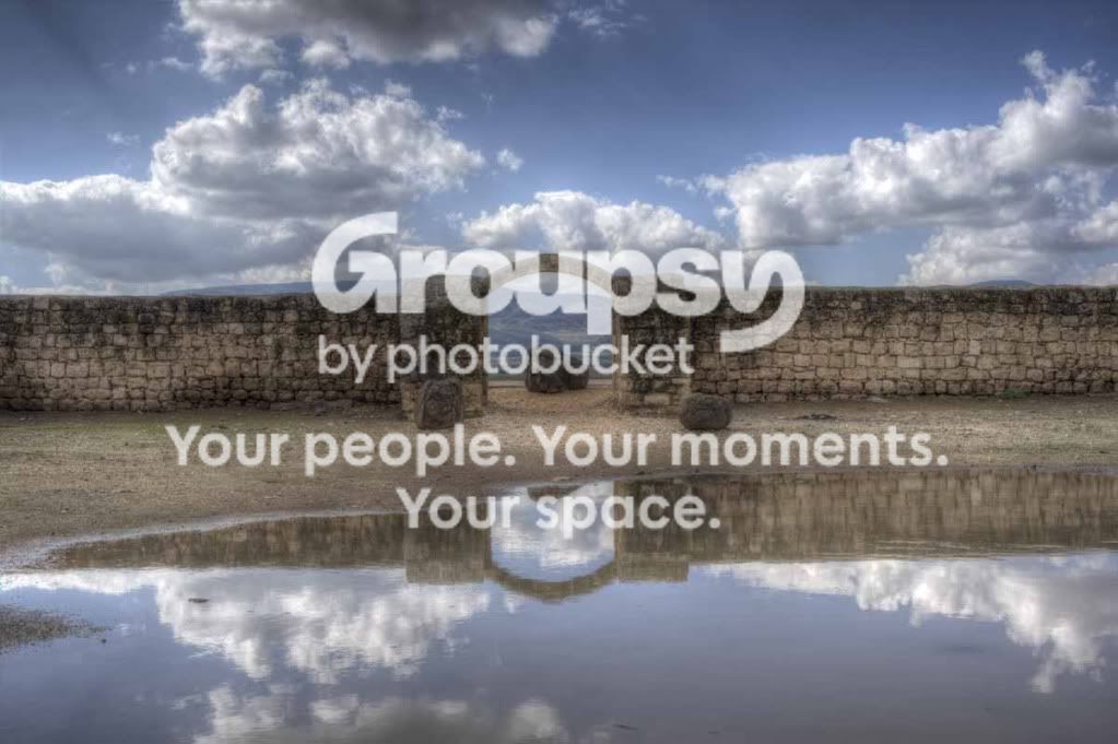
YardaRuins-AncientArchReflection.jpg


2.
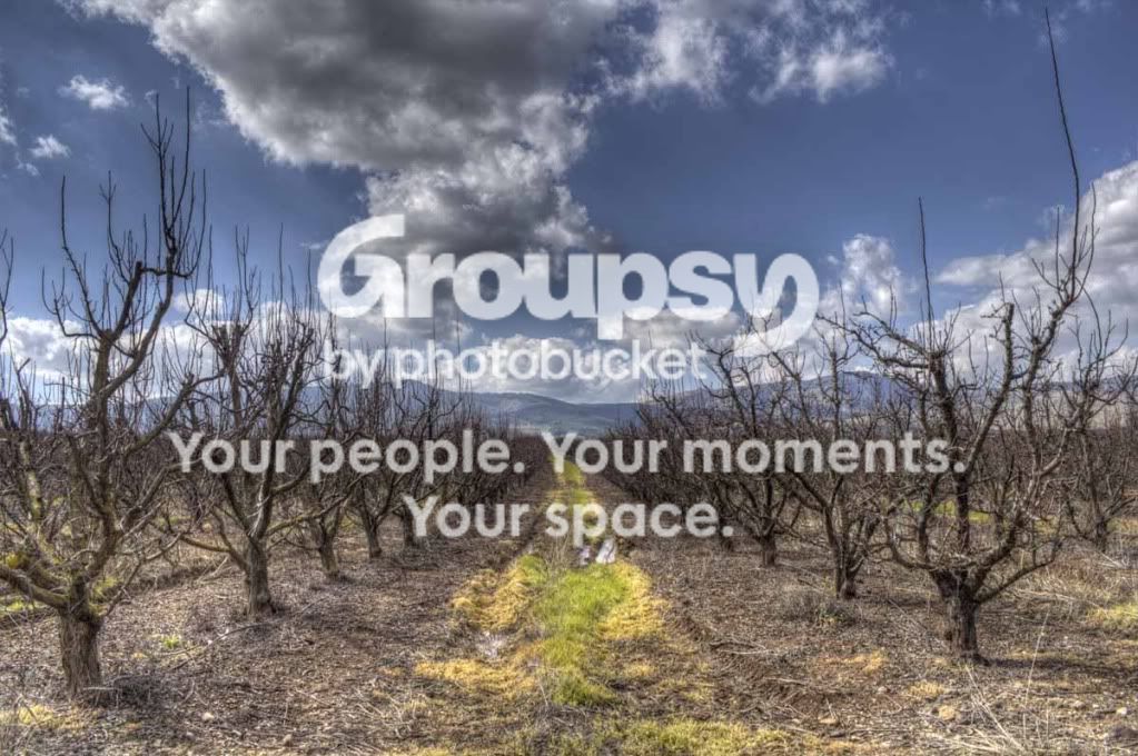
OrchardintheGalil.jpg


3.
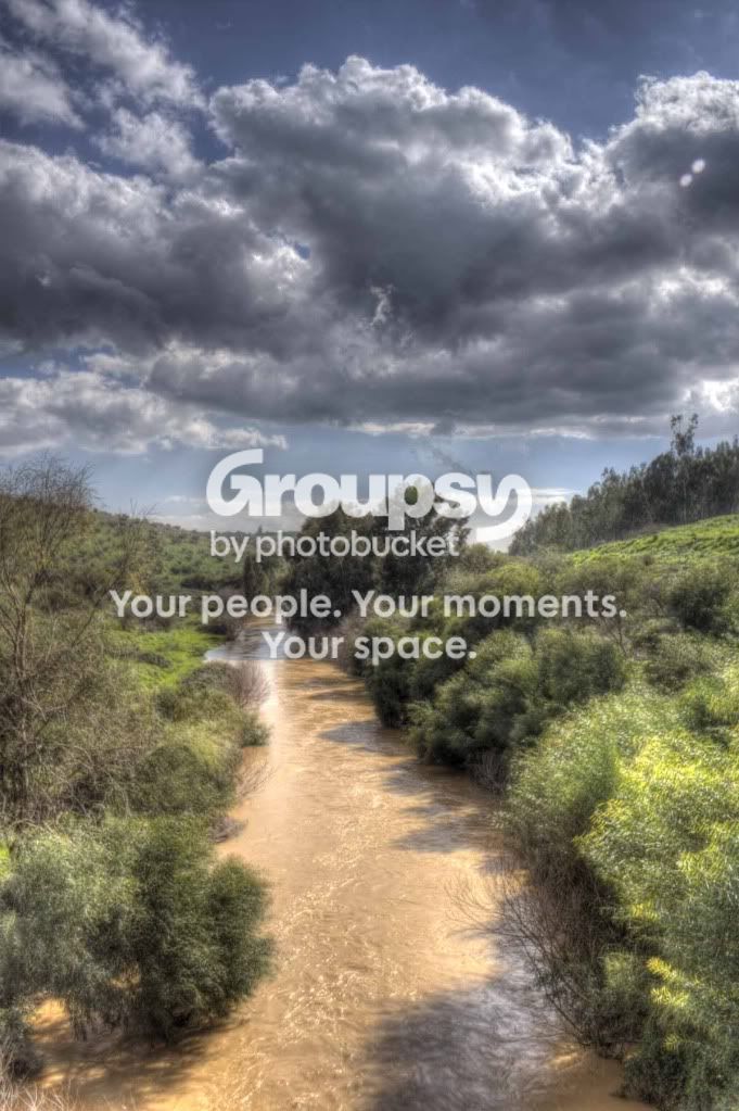
JordanriverintheGolan.jpg


4.
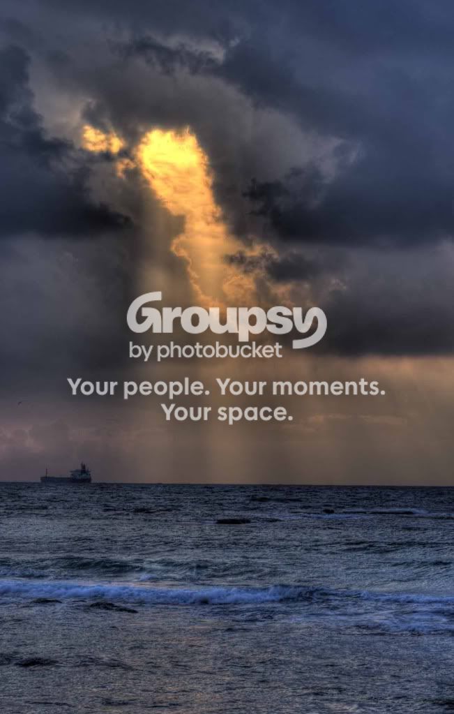
Caesarea-Gapingsunwithship.jpg


5.
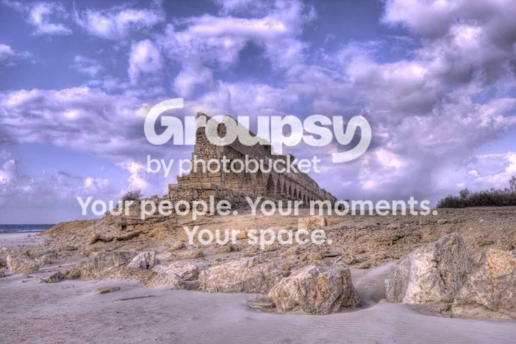
Caesarea-Aquaduct.jpg


6.
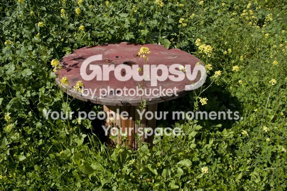
Woodencablespoolinwildgrassfromhigher.jpg


7.
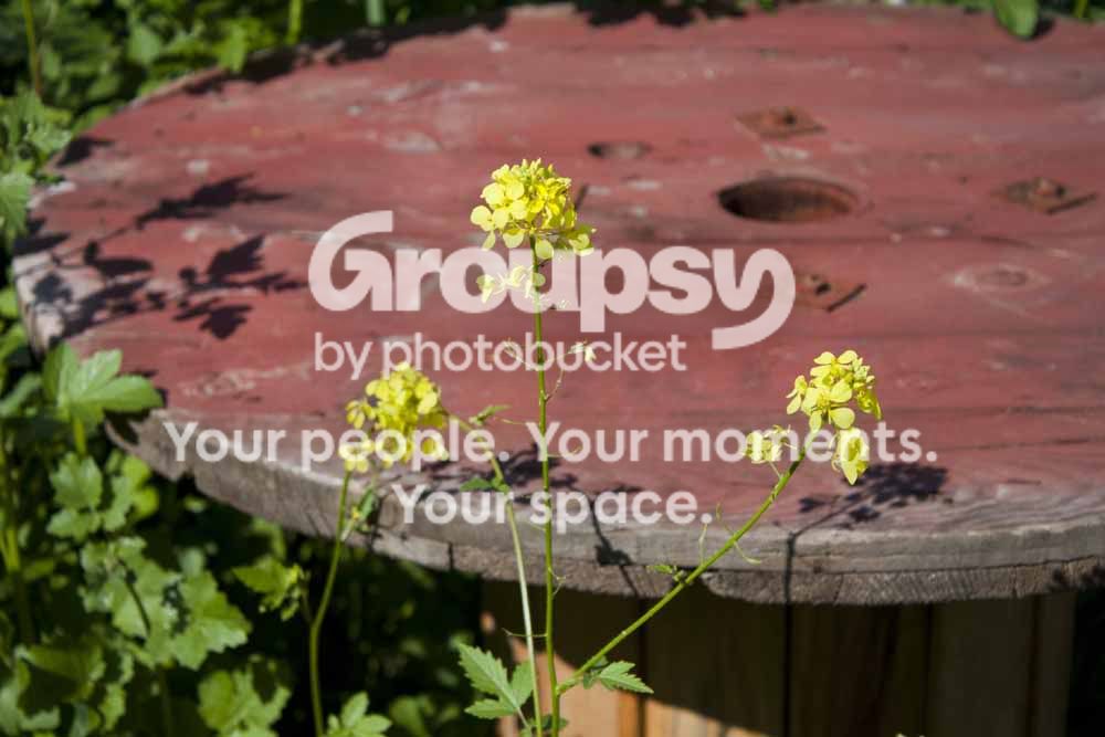
Wildflowersinfrontofcablespool.jpg


8.
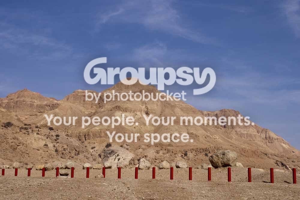
RedpolesunderamountainintheJudeandesert.jpg
 
Too many images for which to provide detailed critique. In general, nice scenes, but the Orton/HDR effect is rather over-done IMO.
 
Sorry about so many images at once.

Any specific "overdone-ness" that you can tell me about?
 
pictures 1-5 are way overdone imo. you should try to tone down the hdr effects.
 
Thanks ITF.

Can you please specify in what way they are overdone?
 
The colors are off, clouds are gray, sky is blue with a hint of gray.

The grass in number 3 is distracting because it doesn't seem sharp and too bright compared to the rest of the picture.

I'm not sure which slider it is in your hdr program (maybe luminosity?) but just seems overdone.
 
I slightly disagree - I think #1 and #3 work very well with the heavy processing.
 
Thanks,
I'll play with them and see what happens. I personally like them this way (either my artistic expression, or I'm just plain biased), but I will see how they look more realistic.
 
Thanks Breaux. Any ideas or recommendations on the others?
 
Thanks,
I'll play with them and see what happens. I personally like them this way (either my artistic expression, or I'm just plain biased), but I will see how they look more realistic.
I personally like how you processed them, with #2 being my fav of the series. It could work to lower the processing strength on the clouds alone to have a nicer contrast of the sky and the ground (they are both dark, etc.) but I really like the composition and subject matter of that shot.

I think the processing of #5 is excellent. I just wish you the composition was a bit different with the main subject not being smack dab in the center, etc. (Like perhaps more of the sea, and closer to the subject, etc.) but all in all I like this series.
 
Personally, #1, #2 and #5 are done well! #3 is a little blurry to me, I would like to see it sharper like #2. The color seems really off on #4, maybe bring down the saturation levels in the blues? Im not sure if its a white balance issue in 1-5 but as others have said, there are some tones in the skys that look off. Not really a fan of 6-8 but I think thats personal taste.
 
Thanks Inaka. I really appreciate it.
 
Tight Knot if you like them, thats what counts. 1,3 and 5 are my favourites. For the first one I would have had the POV lower to the ground slightly. Also I'd add a little more contrast to the pics 1 thru 5.

I still like what you've done though.
 

Create an account or login to comment

You must be a member in order to leave a comment

Create account

Create an account on our community. It's easy!

Log in

Already have an account? Log in here.

Back
Top Bottom