Lazy day in bed C&C Welcome

651stp

No longer a newbie, moving up!
Joined
Sep 19, 2012
Messages
214
Reaction score
33
Location
Minnesota
Can others edit my Photos
Photos OK to edit
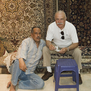
Hi guys/gals just got my 430ex and did my first shot indoors with my lovely model, my old lady. Please let me know on what i can do to improve the picture and myself as an aspiring photographer. THANKS!

vyTA4.jpg


giTzo.jpg


2y3MU.jpg
 
Last edited:
There is an emptiness to her gaze that is quite intriguing. The photo has a casual, organic feeling that makes it appealing to me. There are no major technical flaws to point out that take away from the shot. It leaves me wondering if a moody black and white conversion would exaggerate the look in her eyes.
 
I see some very good elements here. I like the pose, the lighting, the composition, and yes, the white and brown bedclothes. All working for a very nice photograph. My only suggestion is to ask the model (the old lady) to engage with the camera better, either positively, or negatively, doesn't matter to me which.
 
I see some very good elements here. I like the pose, the lighting, the composition, and yes, the white and brown bedclothes. All working for a very nice photograph. My only suggestion is to ask the model (the old lady) to engage with the camera better, either positively, or negatively, doesn't matter to me which.


I would argue that the lack of engagement is what makes this photo strong.

O.K., yes, now that you mention it, if I let my mind wander into certain other areas of the human condition, I can see the relevance of the model's expression.

But still....
 
There is an emptiness to her gaze that is quite intriguing. The photo has a casual, organic feeling that makes it appealing to me. There are no major technical flaws to point out that take away from the shot. It leaves me wondering if a moody black and white conversion would exaggerate the look in her eyes.

Rotanimod, i felt the same with her expression. The main reason for her expression is because, this was NOT a planned shot nor was it staged. She was simply tired and i just said i wanted to test out my new 430ex ii and told her to open her eyes while she was relaxing. So the pose, the look, was all really in the moment and the lighting also. For more info, i took this shot with the speedlight mounted on to the shoe, simply bouncing it off the ceiling. Shot with a 70-200 F/4L at 87mm :) I will try a black and white conversion now that you mention it. TY for the C&C and for further helping me develop my photography skills.

What he said ^ I love her expression/eyes. She's also far from old ;) :drool:
Thanks Trever1t xD i know shes far from old, i've been with her for 7+ years now so its okay for me to call her that now, so she says :p Appreciate your feedback.

I see some very good elements here. I like the pose, the lighting, the composition, and yes, the white and brown bedclothes. All working for a very nice photograph. My only suggestion is to ask the model (the old lady) to engage with the camera better, either positively, or negatively, doesn't matter to me which.
I am shocked that you said you liked all of those elements. As an beginner photographer that is what i was aiming to get correct and i finally have a photo which does it :) so im very flattered to hear you say that. As i replied to Rotanimod, the reason she has no specific expression was because she was basically napping and i said "hey open your eyes im gonna take a few shots." I appreciate your honesty.
 
I agree go for b/w. Nice shot

thanks paige! I am working on a b/w version as we speak! :) Not very skilled in the b/w department as i just started post processing also but will put up a few versions to see what works best.
 
i've added 2 B/W versions, is there one you prefer over the other and why? :)
 
I like the second B&W version...it has more detail in the skin...looks just a little bit better to me than the lighter one, which seems to make her face look shapeless in the cheekbone area, due to the extreme lightness. I agree...the vacuous,empty, almost unreadable,enigmatic look she has is a big part of the appeal.
 
I like the second B&W version...it has more detail in the skin...looks just a little bit better to me than the lighter one, which seems to make her face look shapeless in the cheekbone area, due to the extreme lightness. I agree...the vacuous,empty, almost unreadable,enigmatic look she has is a big part of the appeal.

thanks Derrel, love comments from you! you always have a good choice of words when you comment xD ty so much.
 
original shot is as stated by others a good shot. nothing jumped out thats saying. OMG, fix me. good job.

I like the second B&W version...it has more detail in the skin...looks just a little bit better to me than the lighter one, which seems to make her face look shapeless in the cheekbone area, due to the extreme lightness. I agree...the vacuous,empty, almost unreadable,enigmatic look she has is a big part of the appeal.

this, i agree with Derrel. the tones are less blown out and it made the photo bounds better. Both were good shots, but the second B/W conversion is the better of the two.

i totally agree also, although when i very first started my edits, i always liked blown out pictures for some reason. but the 2nd is def. better.
 
Definitely the second. The BW is a nice rendering and further enhances the empty gaze.

Good job. With your good attitude, you will progress quickly with your knowledge and skill.
 

Most reactions

Back
Top