What's new

Letters

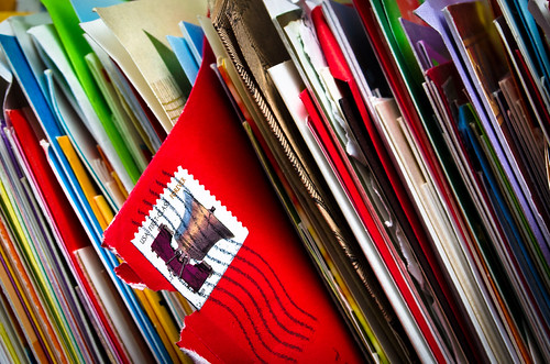
Good...the only problem is that the saturation is hurting my eyes..but it can be my monitor :):)
 
I really like the idea! I agree that the saturation might be toned down just a tad, but not much.
My only real nitpick is that it looks like in the upper left corner there is a little bit of area that looks like the room behind the cards. If it were mine, I'd crop the photo just enough to remove that little bit of background.
 
^^^ Agree with Sharon about the bit in the corner. I'd also consider taking one with the red envelope sticking out only a little - might be more intriguing that way.
 
sm4him said:
I really like the idea! I agree that the saturation might be toned down just a tad, but not much.
My only real nitpick is that it looks like in the upper left corner there is a little bit of area that looks like the room behind the cards. If it were mine, I'd crop the photo just enough to remove that little bit of background.

I see that now, initially I cropped to remove all the space behind but I guess I missed that little corner. Thanks for the tip!
 
KenC said:
^^^ Agree with Sharon about the bit in the corner. I'd also consider taking one with the red envelope sticking out only a little - might be more intriguing that way.

I tried a few different ways, but I wanted to show the stamp so that particular envelope stood out, and the lines on the stamp add interest imo.
 

Create an account or login to comment

You must be a member in order to leave a comment

Create account

Create an account on our community. It's easy!

Log in

Already have an account? Log in here.

Back
Top Bottom