Rick58
Been spending a lot of time on here!
- Joined
- Jun 23, 2012
- Messages
- 4,227
- Reaction score
- 1,473
- Location
- Reading, Pa
- Can others edit my Photos
- Photos OK to edit
First I really want to thank everyone for their input. I realize my photography isn't for everyone but it's what I do and what's important to me, so again, thank you for taking the time to give your comments and critique. I listened to everyone and had given all comments full consideration. I'll try to address all and give my thoughts.
timor: I really liked your idea of the telephoto, but unfortunately the terrain makes it impossible. By the time I backed far enough for even my 135, I was so high the cross was down into the city
Leonore: I liked your idea of raising the cross and making it the highest element of the photo. I raised it even higher to get the cross above the horizon, which really bothered me on the original. I did however keep the courthouse. I wanted to keep the "high-rise" element to help form the feeling of "city"
Chris: I gave as much room to the right of the courthouse as possible. Just outside the right edge of the frame, the county access building starts, which is as high as the courthouse. Unfortunately, it is partly obscured by foreground branches, so I wouldn't include it. Sky is cropped to a comfortable height. Your mention of the stone lines? Way too deep for this farm boy. But if it works, yeah I planned it
John: plumb and level
bribrius & ECphoto. Thanks for your comments. I appreciate it.
I think that about covers everyone. Thanks again!
Digital has made me sloppy. Shoot 10 frames and hope one turns out. Then fix the sloppiness in post.
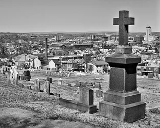
I spent more effort on this particular shot then any since I picked up my first digital. I forced myself back to my films days. Slow and patent. I started this shot at 10am this morning, it's now 2PM. Tripod, cable release and bulb level. Waited an hour for the sun to clear the trees, removing the shadows from the foreground tombstone. Results is a nearly full frame photo accept for the 8x10 crop which required very little post to hopefully retain image quality.
Anyway, for those still here, here's the result:
timor: I really liked your idea of the telephoto, but unfortunately the terrain makes it impossible. By the time I backed far enough for even my 135, I was so high the cross was down into the city
Leonore: I liked your idea of raising the cross and making it the highest element of the photo. I raised it even higher to get the cross above the horizon, which really bothered me on the original. I did however keep the courthouse. I wanted to keep the "high-rise" element to help form the feeling of "city"
Chris: I gave as much room to the right of the courthouse as possible. Just outside the right edge of the frame, the county access building starts, which is as high as the courthouse. Unfortunately, it is partly obscured by foreground branches, so I wouldn't include it. Sky is cropped to a comfortable height. Your mention of the stone lines? Way too deep for this farm boy. But if it works, yeah I planned it
John: plumb and level
bribrius & ECphoto. Thanks for your comments. I appreciate it.
I think that about covers everyone. Thanks again!
Digital has made me sloppy. Shoot 10 frames and hope one turns out. Then fix the sloppiness in post.
I spent more effort on this particular shot then any since I picked up my first digital. I forced myself back to my films days. Slow and patent. I started this shot at 10am this morning, it's now 2PM. Tripod, cable release and bulb level. Waited an hour for the sun to clear the trees, removing the shadows from the foreground tombstone. Results is a nearly full frame photo accept for the 8x10 crop which required very little post to hopefully retain image quality.
Anyway, for those still here, here's the result:
Last edited:


 D). As a warning. Digital doesn't change anything from the old rules of creating an image.