Lighthouse- Can't Make Up My Mind

Dominantly

TPF Noob!
Joined
Jul 30, 2009
Messages
3,032
Reaction score
168
Location
San Diego, CA (RB)
Can others edit my Photos
Photos NOT OK to edit
I took a few different shot of this tiny oyster shell covered lighthouse leading past the Taylor Jetty on Samish Bay, WA.

I did some curves and played with a gradient filter a bit, then some selective smart sharpening and unsharp masks on these.

Let me know if you have a preference.

1. Isolated


2. Pulled Back a bit


2b. For Fun


3. More area to the right


4. A shot from the other side of the jetty (I posted previously but ddin't get many opinions).
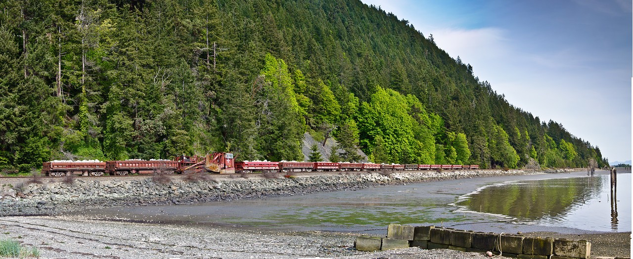
870770645_Rx6LJ-X2.jpg


Thanks :thumbup:
 
Last edited:
Thanks for the post.
I think the 3rd one may have a bit of a purple hue that I didn't notice before.. hrmmm

For the 2nd one, I was trying to figure out a way to show the lighthouse as a partially illuminated safety feature at the harbor entrance, in a sort of grand scene. I probably should have got on the deck for the shot or something (but there was bird **** everywhere :lol: )
 
What do you think of this cat shot I snagged of my friends cat sitting and crying at the gate?
I was glad he just sat there while I took about 10 shots of him, trying to get the fence balanced just right with his eyes. He was meowing in between shots. I was lucky I had decent light on the other side of the gate.

876164172_KDnCr-XL.jpg
 
I isolated him into his own layer then I used a preset in Topaz Adjust 4, on him. I think it was crisp or drama. Can't remember exactly, but it was one of the presets for sure.
Then I added him back by merging and then edited the curves, levels, & Brightness/contrast of the photo.
He was standing on concrete and the sun was on his side, so it bounced back up onto him nicely and onto the Bamboo as well. On my side there was a big tree/ bush, thus the difference in lighting.
 
I also like the first image. The clarity is spot on. The second image I really think is a stronger composition, you've captured a boat, some birds and some nice foreground. It tells the viewer more of a story, but it appears a bit soft in focus and the image is too noisy that is why I would pick it as my second fav.

I'm not sure what you were trying to achieve with the train image. It appears to me to have a "bit" of the illustrative look to it, which if that was your goal then you nailed it. Not sure if this was an HDR or Topaz but it just has a quality about it that is not realistic. Don't mean to sound critical because it is heard to put my finger on it.
I love the cat photo. Just like a cat to be sneaky and peaking at you. Great clarity, especially the eyes. well done
 
I like lighthouses and do a lot of them...

Number 1 is OK, but I like #2.. it shows what the lighthouse is there for and sets the tone/scene for the shot... It could have been framed with the lighthouse just slightly further to the left, or maybe even a crop would work - still, it's good composition. The leading lines of the jetty take your eyes right to it

Seems a bit noisy in the sky...........:D

Still, it's got potential to be framed and on the wall..........
 
On a laptop monitor. #1, like the smoothness of the water. the color and sat of the sky and the stonework of the lighthouse, brightness of the stonework. Also like the color of the door. It's a nice pleaseing pop that goes well with the overall color tone of the photo without looking like selective coloration. Maybe run around the sky with a blur tool if it really is noisy when looking on a better monitor. #3, like the greens, again pretty natural, mine have a tendency to go neon and the like. I also like the bit a red pop from the train against the background. As far as the cat, I'm always a fan of Peek-a-boo shots.
 

Most reactions

Back
Top