What's new

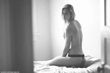
Lindsey~ Boudoir-ish [NSFW]

I liked them as they are. I despise the idea that a woman has to be contorted and "taut" to be considered sexy. The poses, the lighting, the angles, the rumpled bed all point to a very naturally sensual atmosphere, which I think is sexier than any studio-lit porno-esque set-up.
 
I liked them as they are. I despise the idea that a woman has to be contorted and "taut" to be considered sexy. The poses, the lighting, the angles, the rumpled bed all point to a very naturally sensual atmosphere, which I think is sexier than any studio-lit porno-esque set-up.
I don't think it's demeaning or anything.

I think it's just a natural pressure arising from the fact that photographs are not the same things as 3-dimensional scenes. Your pupils can't change the lighting as you look at a photo, you don't get 3d information (which is the main reason normal poses can look odd), there's no motion, you don't have the same context as in real life (for instance, if you were this woman's lover and were coming home to find her like this, you would know her, love her already, be aware of what's normal for her versus provocative, what she's trying to communicate with you, etc. which will all affect how you interpret the mood of the scene).

When you don't have 3-d info, then strange poses are needed to avoid collinear body parts looking strange that wouldn't have looked strange if you could tell that one was way behind the other. And when you don't have motion, you can't always tell what things are strangely lined up parts for just an instant or a squashed leg muscle that will soon shift, versus permanent body fat or body shape or proportions. Thus, rigging the scene to communicate information with the specific knowledge already in mind that this will be 2-d is perfectly reasonable.

And "tension" doesn't necessarily mean "arched into a pretzel with nothing but boobs and legs visible while licking your lips..." There are plenty of tasteful, yet more taut poses. The goal is to avoid squishing muscles and such from folded up limbs and tight, unstretched poses. That and angling everything to not unfortunately line up in bad ways.

You can do all of that and still make it look as tasteful and formal and respectful as a presidential office scene if you want. Or you can make it a porno looking thing. Neither is inherent to the suggestion to care about pose and tension.
 
I liked them as they are. I despise the idea that a woman has to be contorted and "taut" to be considered sexy. The poses, the lighting, the angles, the rumpled bed all point to a very naturally sensual atmosphere, which I think is sexier than any studio-lit porno-esque set-up.
Minor changes here. I wasn't talking about adding lava lamps and whips. Just even changing her position, tweaking the lighting a small amount can make a huge difference. You don't want to add inches to someone, because of the lack of lighting and heavy shadowing.
 
I am a fan the way it is. It would also be nice if she wasnt looking at the camera.
I like the lighting as well and personally don't feel that having her face perfectly lit is necessary for a good image; to me the mood and natural feeling are what's important. I do agree that she could have looked away from the camera to make an interesting shot, but the eye contact has a mood that I enjoy. As an artist I am happy with these images, and the client is elated; according to her we got the exact mood, feeling and light that she was hoping for.

I find it amusing that your sig file carries a link to "the Art of Constructive Critique" The Art of Constructive Critique: A Crash Course in The Art of Constructive Critique

and that despite multiple posters suggesting that the lighting in this is not helping advance the photos, you basically tell everybody they're full of $hi+ for mentioning that the lighting is not all it could be, and that you "like the lighting" and furthermore your subject stated, "we got the exact mood, feeling and light that she was hoping for".

Your response seems like yet another variation of the old, "But I LIKE IT THIS WAY!" reply to C&C.
 
I am a fan the way it is. It would also be nice if she wasnt looking at the camera.
I like the lighting as well and personally don't feel that having her face perfectly lit is necessary for a good image; to me the mood and natural feeling are what's important. I do agree that she could have looked away from the camera to make an interesting shot, but the eye contact has a mood that I enjoy. As an artist I am happy with these images, and the client is elated; according to her we got the exact mood, feeling and light that she was hoping for.

I find it amusing that your sig file carries a link to "the Art of Constructive Critique" The Art of Constructive Critique: A Crash Course in The Art of Constructive Critique

and that despite multiple posters suggesting that the lighting in this is not helping advance the photos, you basically tell everybody they're full of $hi+ for mentioning that the lighting is not all it could be, and that you "like the lighting" and furthermore your subject stated, "we got the exact mood, feeling and light that she was hoping for".

Your response seems like yet another variation of the old, "But I LIKE IT THIS WAY!" reply to C&C.
I never in my life thought I would say this but............I agree with Derrel. If you are happy with your shoot and it is the best you could possibly do for your portfolio, not just your present client, then carry on.
 
Last edited:
kathythorson said:
I never in my life thought I would say this but............I agree with Derrel. If you are happy with your shoot and it is the best you could possible do for your portfolio, not just your client, then carry on.

I KNEW this would happen today, 'cause this morning I made toast and...there was the image of Kay Thor on my toast slice!!!!!

$Derrel_Kay Thor on toast.webp
 
I am a fan the way it is. It would also be nice if she wasnt looking at the camera.
I like the lighting as well and personally don't feel that having her face perfectly lit is necessary for a good image; to me the mood and natural feeling are what's important. I do agree that she could have looked away from the camera to make an interesting shot, but the eye contact has a mood that I enjoy. As an artist I am happy with these images, and the client is elated; according to her we got the exact mood, feeling and light that she was hoping for.

I find it amusing that your sig file carries a link to "the Art of Constructive Critique" The Art of Constructive Critique: A Crash Course in The Art of Constructive Critique

and that despite multiple posters suggesting that the lighting in this is not helping advance the photos, you basically tell everybody they're full of $hi+ for mentioning that the lighting is not all it could be, and that you "like the lighting" and furthermore your subject stated, "we got the exact mood, feeling and light that she was hoping for".

Your response seems like yet another variation of the old, "But I LIKE IT THIS WAY!" reply to C&C.
You're right! I do like it this way! I can disagree with a critique brother. I never once stated that everyone who disagrees with me is full of ****, nor am I the only one who feels that they are good as they are. I'm not saying that they are perfect or couldn't use improvement or that yours or others critique is wrong, so you don't have to act like I'm telling everyone that they are full of **** simply for having a different opinion. Bringing up my signature link and throwing it in my face like it's ironic makes no sense because not once did I call anyone wrong. I simply disagreed.
 
Last edited:
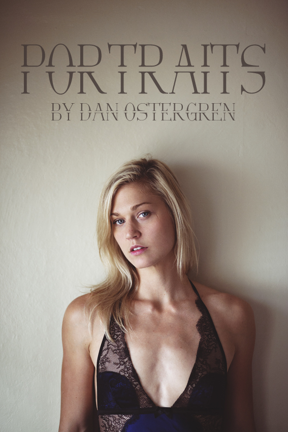
A couple more. The first is an experiment that I plan to use for my facebook page profile photo.

mg_9791cover_by_danostergren-d6l8vrw.jpg


And I know that this shot has blown out highlights that are distracting to the eye, but I like what it does for the image.
trust_by_danostergren-d6l7y8f.jpg
 
Last edited:
Last 3:

1) Awesome. For a splash ad / profile pic, it balances your business name and the model very well. Also just very well lit, nice expression, etc.
2) Bleh. My eye goes literally everywhere except the model. If your goal is to do a study on curtains, then this is a good photo. If you're intending it to be a portrait, then it does not work. Same issue as with the original photos posted in this thread, but 3x more extreme fill light problem. The highest contrast and detail and everything should be on the focal point of your image. In other words, all the light information. That's why it's "photography" (light writing)!
3) Also awesome. You're using the light to highlight the intended subject, to sculpt her body brilliantly, and my eye stays on the girl 100%, like it should. Really nice portrait.
 
There seem to be two kinds of comments about lighting on TPF.

Far and away the most common sort boils down to "I don't light things that way, therefore you are wrong"

The second, rare, kind is "I think I see what you are trying to do, and I think that different lighting would accomplish that better"

There's no such thing as "correct" lighting divorced from the goal of the picture. The knee-jerk "Needs fill" in response to not being able to see her eyes clearly is, while not quite worthless, certainly not the most valuable comment ever. Sometimes, I dare say, the commenter really means "I think I see what you want here, and to accomplish that goal more effectively you need to see her eyes more clearly, and to do that you need fill" which gets boiled down to "needs fill". More often, though, it's simply that the commenter thinks that the eyes need to be clearly visible in any picture of a person. Which is a commonly held belief which is wrong.

Now, I didn't get a strong sense of what Dan's going for here, to be honest. The title suggests boudoir, the pictures themselves are a touch ambiguous, and his later comments speak contrary to the boudoir thing. So, it's not at all clear what the hell he was even going for. That just means that comments need to be made more carefully, and ideally start with "well, if you want a traditional blah blah look then blah blah blah", if you really want to be helpful.

The point about tautness in the body isn't some objectification thing. The fact is that a static image makes our bodies look droppier and slumpier than they are, so you have to compensate -- if you want to avoid that look. This girl would look incredible just walking around, in a video. To get that same awesome physicality in a static picture, she's got to tense up and twist a bit. To convey her own reality across the barrier of a 2D static picture, she needs to act unreal. That's how it is.

Ask any competent actor if you can convey a naturalistic performance on stage by simply acting natural.
 
The knee-jerk "Needs fill" in response to not being able to see her eyes clearly
It's not that.

It's that the model has ALL of the detail in this photo. A really intricate knitted top, the necklace, face, hair, everything I might care about in terms of interesting stuff in a photo (since otherwise it is very standard)

But ALL of that detail is completely flatly lit and dark, so my eye doesn't go to any of it. My eyes spend their entire time in the featureless, boring curtains, until I get tired of curtains (which is very quickly), then I move on from the photo entirely and do something else.

Like I said, if his goal is to show off the curtains, then it's great. Otherwise, I can't really think of any goal the photographer might have had that this photo would accomplish it, in terms of "I think I see what you are trying to do." I think what he is trying to do is to take a standard portrait picture of a girl with a nondistracting background and plenty of detail in the girl to keep us interested. That's what it looks like he is trying to do. And that's the opposite of what the lighting achieves.


By contrast, the photo in this thread here has super dark parts of the model, and you can't see her eyes at all, but I think it is extremely successful, and said so (I didn't suggest fill light there): http://www.thephotoforum.com/forum/black-white-gallery/338379-black-n-white-story.html

The difference is that the B&W photo clearly seems to be trying to go for form and pose study and mystery, and the lack of fill accomplishes those goals (the outline and lit portions are enough to see pose and form). Whereas this photo does not have any air of mystery at all really, nor any particularly unique pose. Just a girl sitting in a window. The interesting part of it is therefore not the overall blunt shapes (which you can see, but aren't terribly interesting), but instead the details are what's interesting here. And those are lost in poor fill.

So yeah, I considered what it looked like he was trying to do. And that's what he does not seem to be doing in that photo.

 
One of us is lost here, I don't see any pictures here with either curtains or flat lighting? Do you mean the second one of the second set? I don't think anyone said that it needs fill, so. That one's definitely the weakest of the lot, mainly because the brightest areas and the highest contrasts are in uninteresting places.
 
One of us is lost here, I don't see any pictures here with either curtains or flat lighting? Do you mean the second one of the second set? I don't think anyone said that it needs fill, so. That one's definitely the weakest of the lot, mainly because the brightest areas and the highest contrasts are in uninteresting places.

Yes the second one in the second set.

Sorry, I guess they're not curtains. Those are just the ridges in the window frame molding I was misinterpreting as curtain folds.

And I said it needs fill, in the post immediately preceding yours. Fill would make it so that, as you say, the brightest and contrastiest areas would no longer be in uninteresting places.
 

Create an account or login to comment

You must be a member in order to leave a comment

Create account

Create an account on our community. It's easy!

Log in

Already have an account? Log in here.

Back
Top Bottom