Line of Trees

Part135

TPF Noob!
Joined
May 5, 2014
Messages
10
Reaction score
11
Location
Oregon
Can others edit my Photos
Photos NOT OK to edit
I feel like such a noob, it's with more than a little hesitation I post a shot here. However, I've learned that the only way to improve is through thoughtful criticism. I've read so many helpful and insightful comments on this forum, I know I'll be getting professional help...which my wife says I need. ;)

Thanks in advance!

Cliff


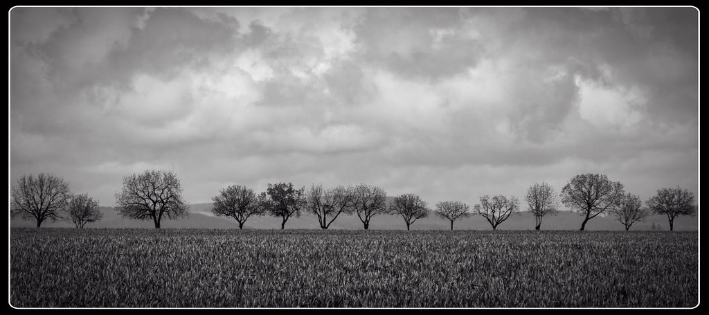
Row of Trees by Slow Glass Media, on Flickr
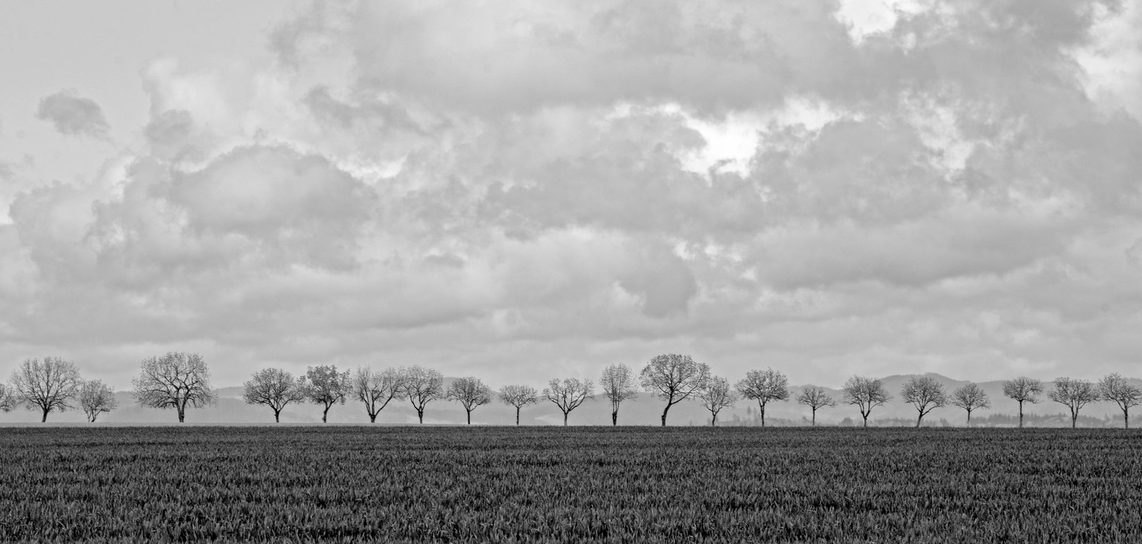
 
Its good, I cant see on my screen if the focus is right, possibly a little soft on the tree detail but the composition is awesome. Id just ditch the frame :) Also its ever so slightly off level if im going to get picky
 
In a shot where the main subject of interest goes from border to border, any vingetting detracts from the overall composition. So don't do that.

At first, I find that I'm looking for yet another object of interest upon which to focus my attention, but then I remember that some very powerful photographs are just this simple. So then I wonder if it is too simple or not simple enough.

The tonal range is not what I would like here, and I realize that digital (if it is digital) generally will not have a wide range of tone, but you can still improve it some in post. So I would say jack up the tonal range if you can, lighten it just a bit overall, and see what you get.
 
Thanks for the excellent comments! Here's another attempt with changes to cropping and tone. I also ditched the vignette and border. Better?

Tree Line Redux by Slow Glass Media, on Flickr
 
Thanks for the excellent comments! Here's another attempt with changes to cropping and tone. I also ditched the vignette and border. Better?

Tree Line Redux by Slow Glass Media, on Flickr

That's good also. I would have kept a little more contrast but I like it better than the first edit.

Sent from my Nexus 5 using Tapatalk
 
i think i liked your original better. it just became less "mysterious".
 
On the second one id use the BW tone tool to drag the blues down darker in the sky
 
it looks way worse than your original one...
 
it looks way worse than your original one...

Which is to say the first one is worse and the second one is way worse? ;)

I agree that the 'mystery factor' has drained away with the lighter version.
 
I like the original - looks like you have some nice black in the tree trunks, maybe tinker a little with the white in the clouds, but not much. I learned to adjust B&W for a 'black' black and a 'white' white somewhere in the image and that's usually my starting point. Looks like you almost have that, I don't think I'd do more than a slight adjustment.

This might be a bit wider than I would have done even for a wide angle or panoramic shot, because it's a long expanse for the viewer's eyes to keep going, but I think this is pretty cool. The sky really helps make this picture interesting I think, and the texture of the sky seems to be balanced by the texture of the grass.

I don't think you need the border, if you printed and framed it that's where you could probably use a white mat and black frame. I could see this framed (and hanging over someone's sofa?).
 
Yup. while trying to get more tone, I think I flattened it too much. How's this?

Image in post #8 has less contrast. I wonder what the original exposure looked like because I'm seeing the clouds o.k., but the foreground is way too dark compared to the rest of it. Do you have the color version?

If you would like someone to jump in and show you, you can change your profile edit preference to "My Photos Are OK to Edit". Your call.
 
Really nice photo. Looks like there would be a fair bit of latitude in the raw file to punch up the contrast to where it needs to be. The "frame" thing does the result a disservice IMO, because it makes it look like you've passed the photo through some cheap-o free photo app from the app store (and didn't even bother to pay the $2 to remove ads).
 

Most reactions

New Topics

Back
Top